
Surf Haus Wellness
A shared home for movement and recovery.
Overview
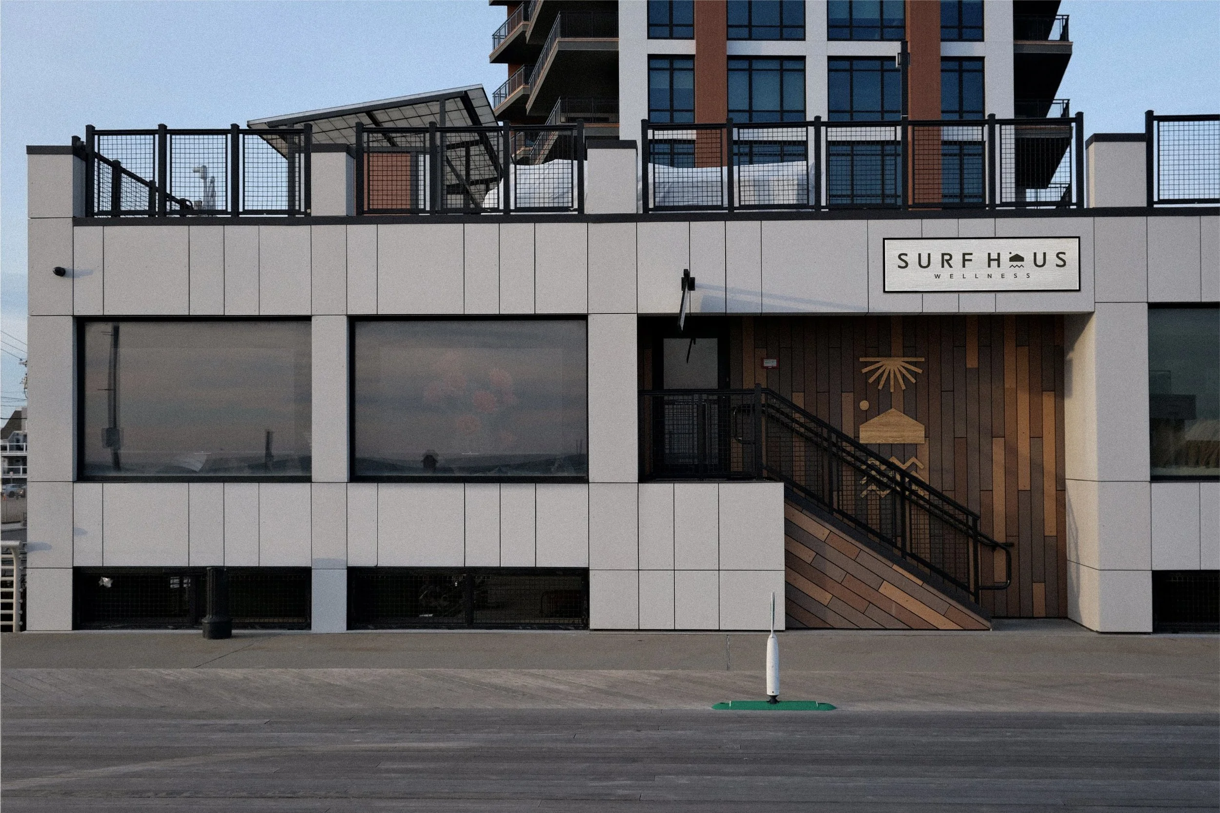
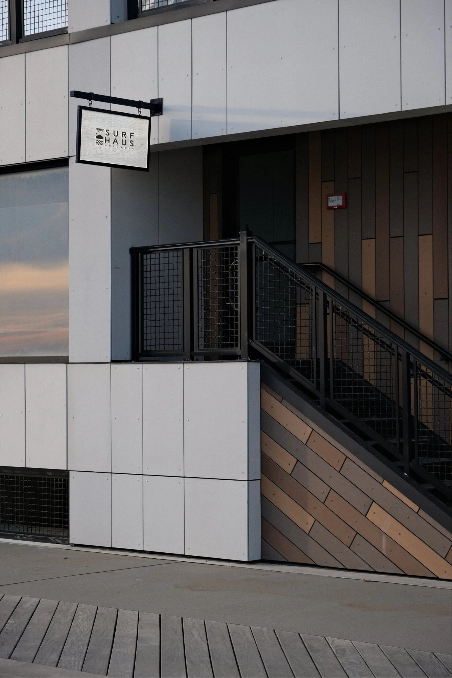
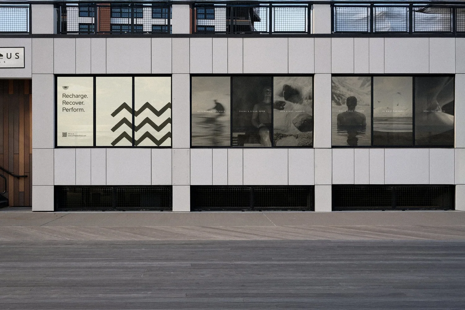
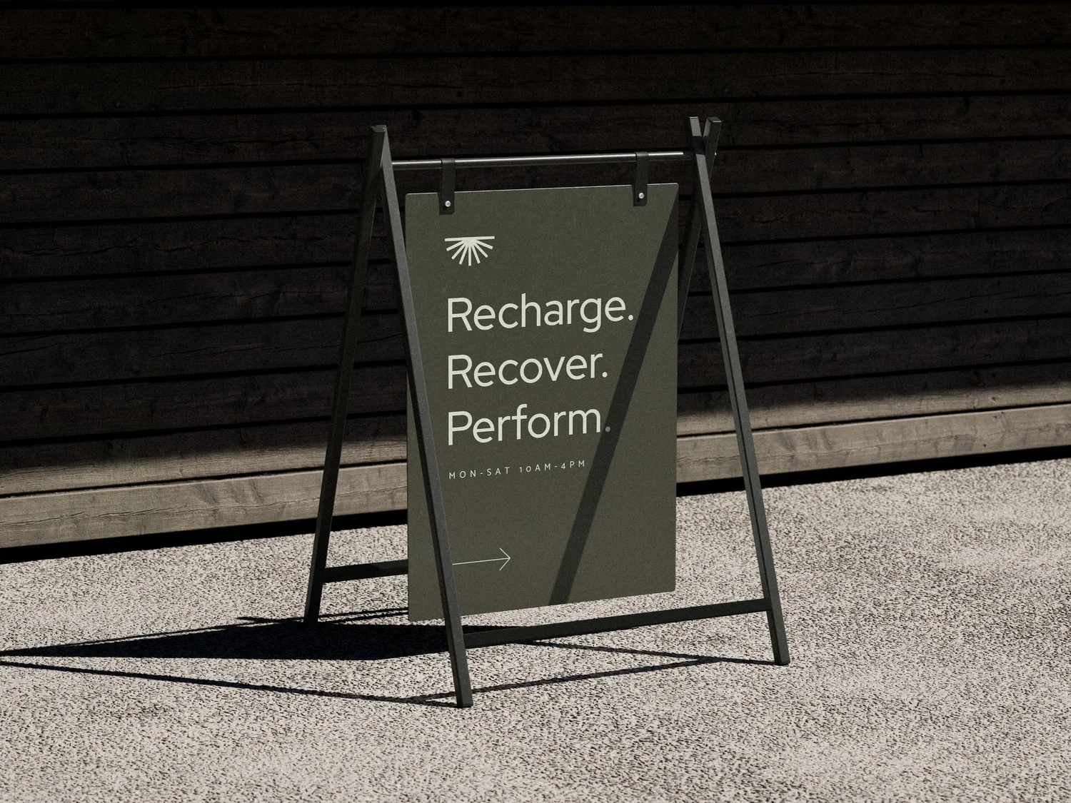
Surf Haus Wellness is a recovery and performance centre on the Long Beach, New York boardwalk, steps from the Atlantic. Developed ahead of opening, the brand brought together the physical demands of an active lifestyle and the restorative qualities of its coastal setting. The identity extended across the website, storefront, signage, print and social, establishing a consistent presence from first discovery to arrival.
01
The Brief
Surf Haus needed to feel credible to people serious about training and welcoming to those approaching wellness through recovery and everyday care. The challenge was to give performance and restoration equal weight within the identity, with enough flexibility to move between energetic communication and quieter moments in the space.
As a new business, that identity also had to establish recognition across the launch, connecting its digital presence with a distinct physical home on the boardwalk.
02
The Idea
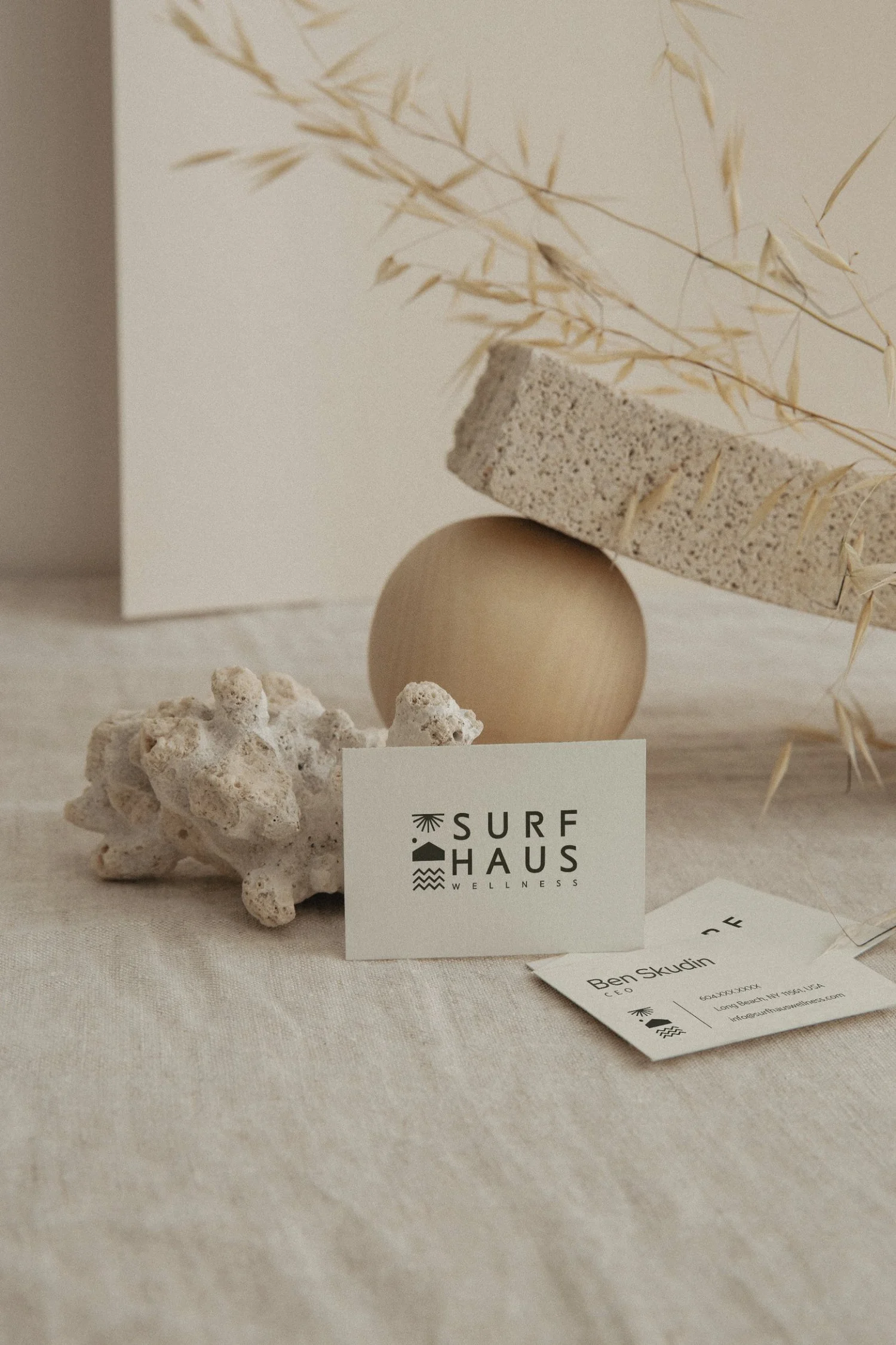
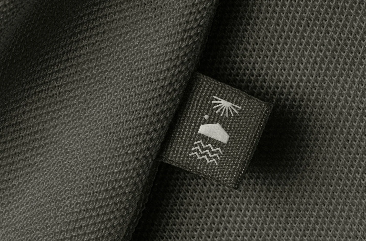
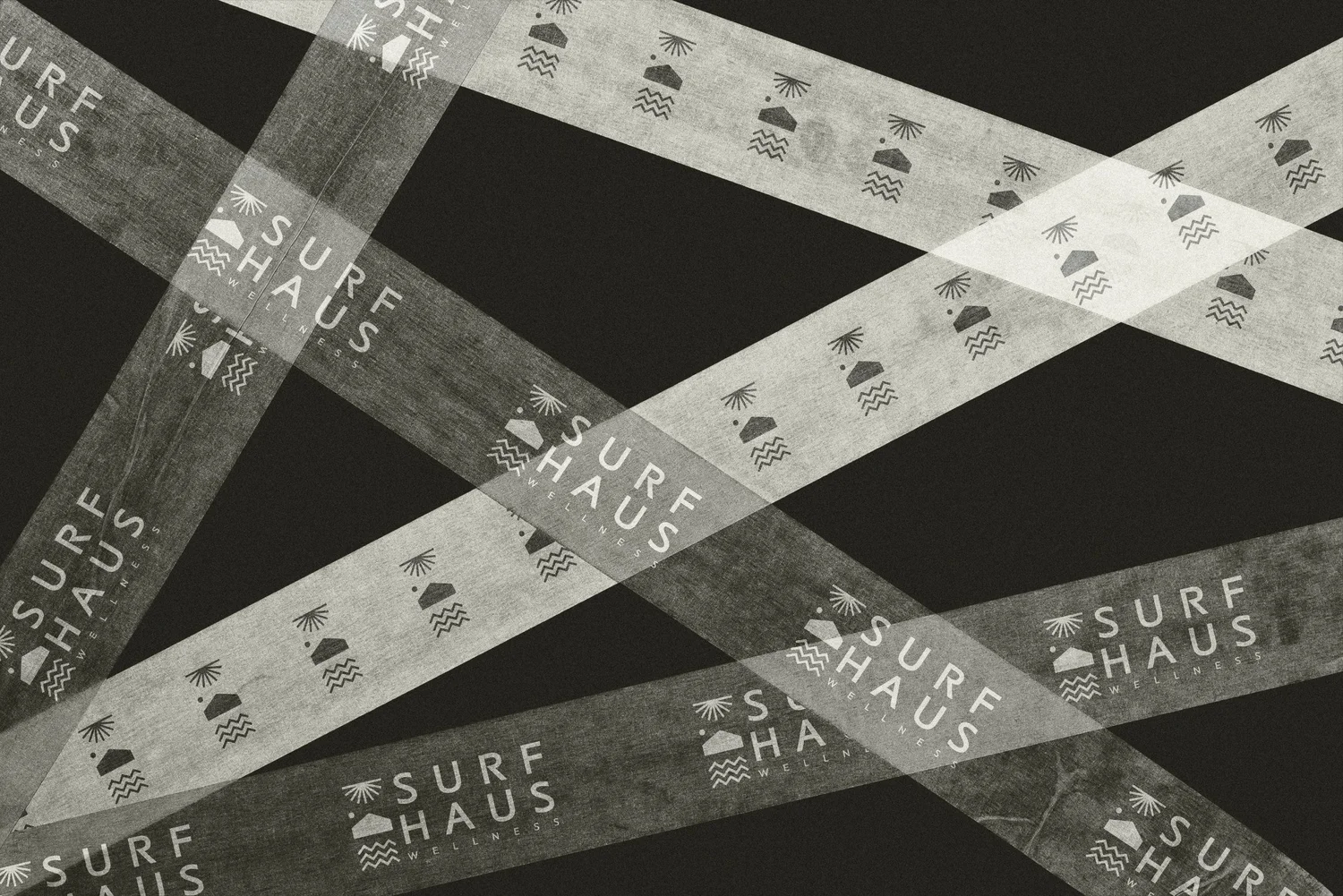
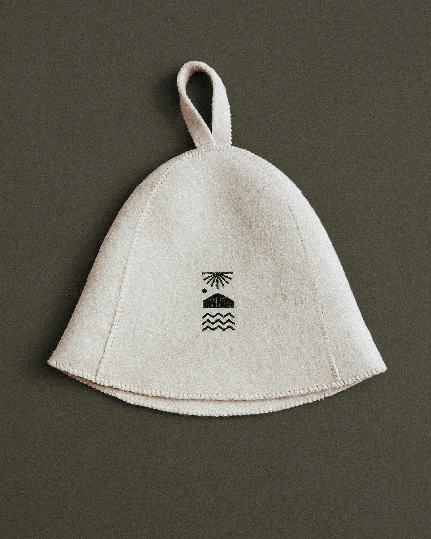
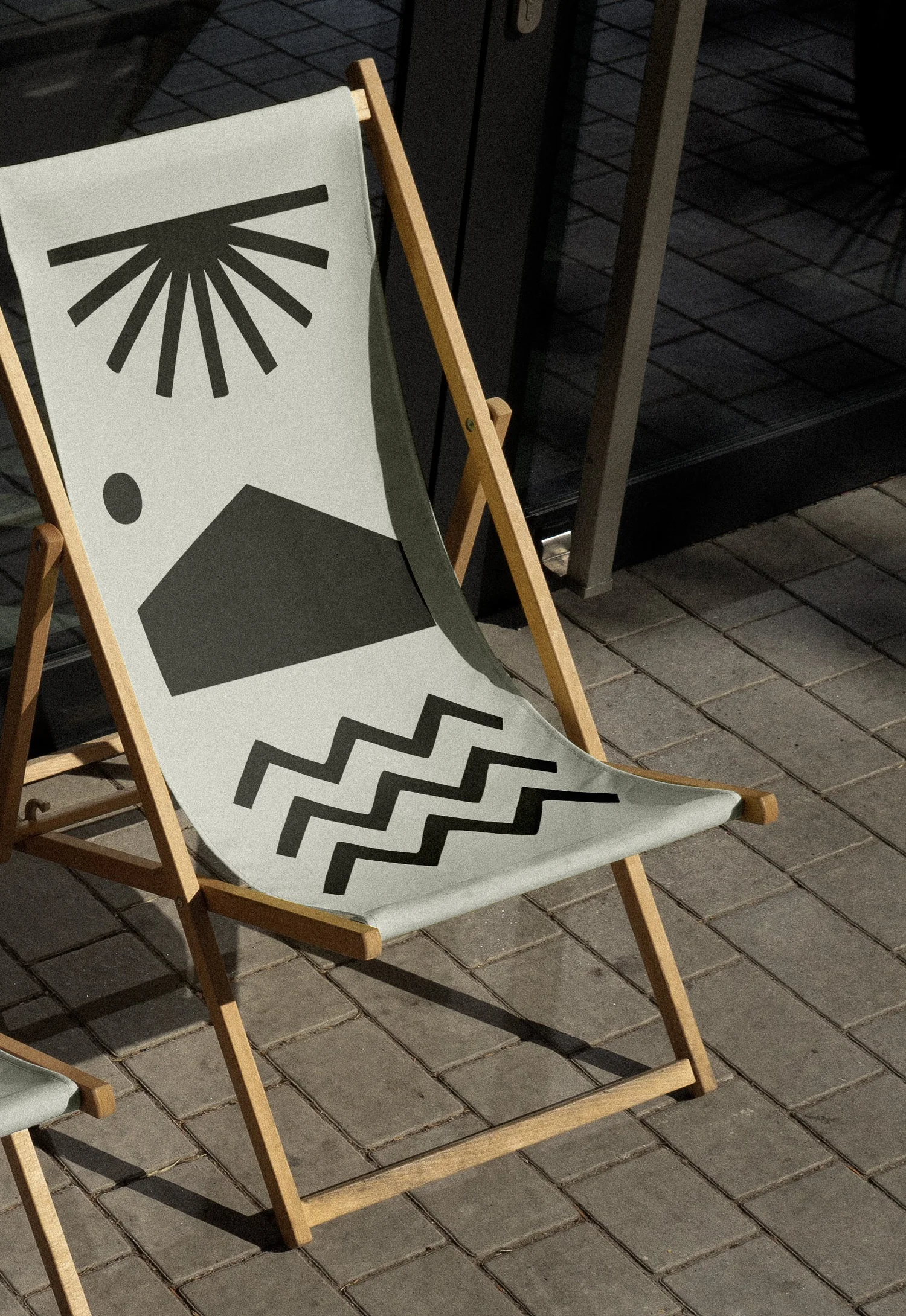
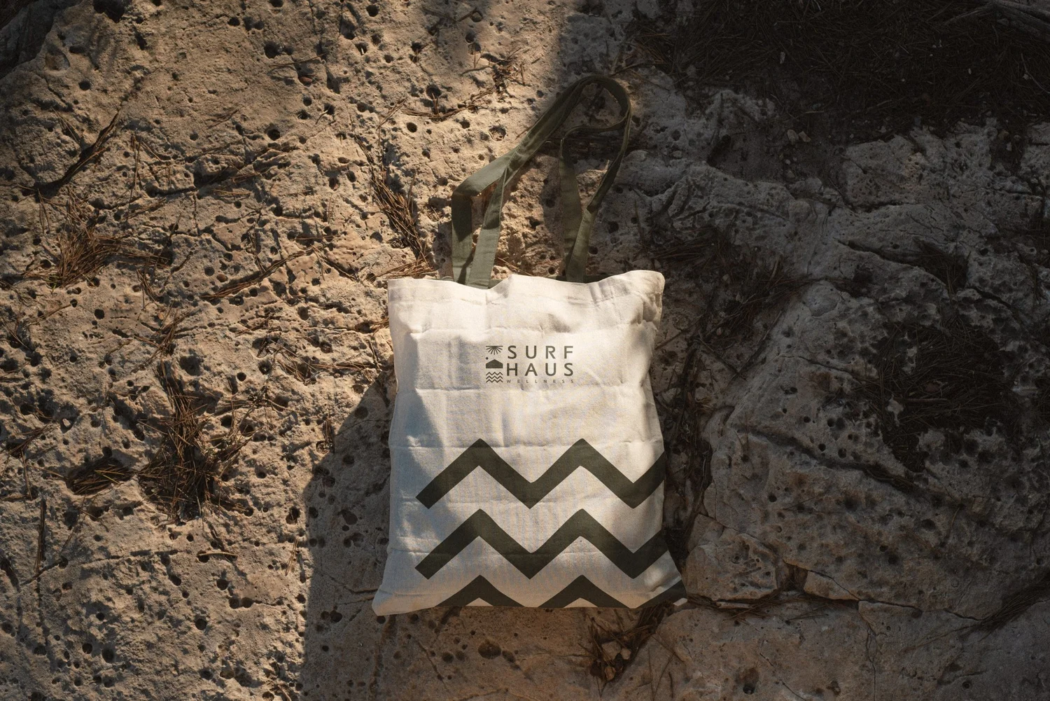
Sun, surf and sanctuary provided a framework for the identity, connecting the energy of the coast with a sense of shelter and belonging. The house-shaped mark gave that idea a simple, recognizable form, placing care and community at the centre of the brand.
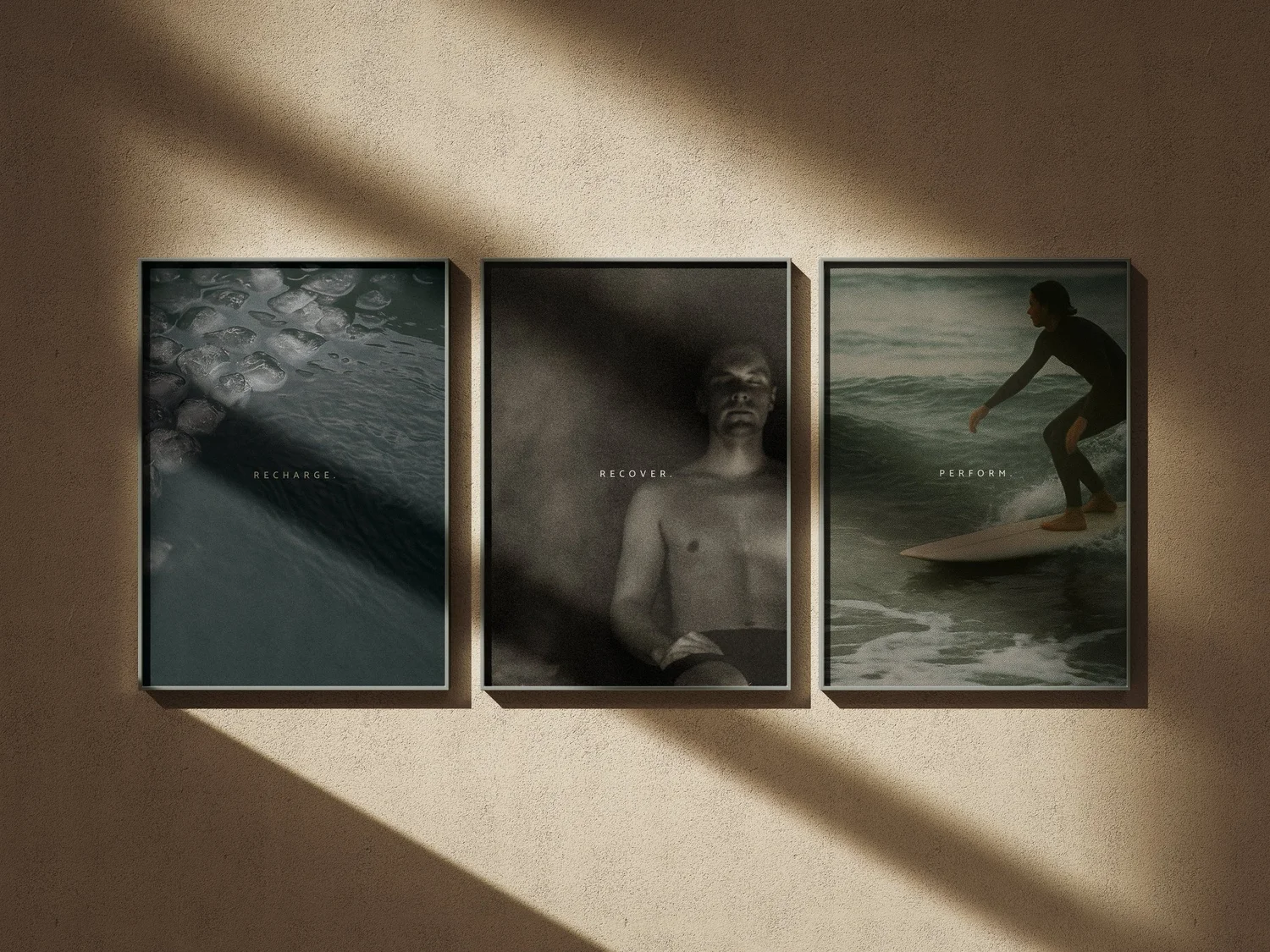
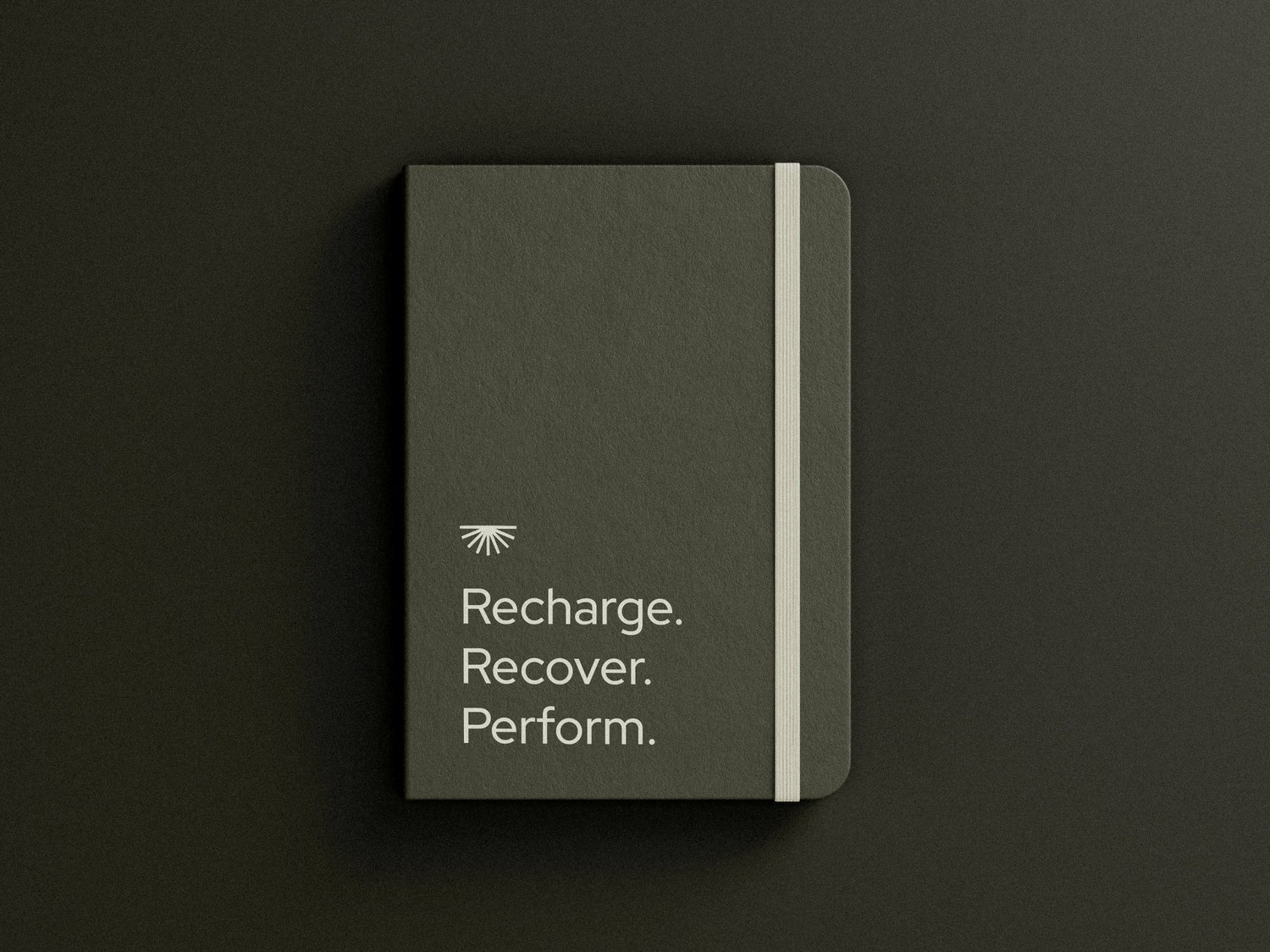
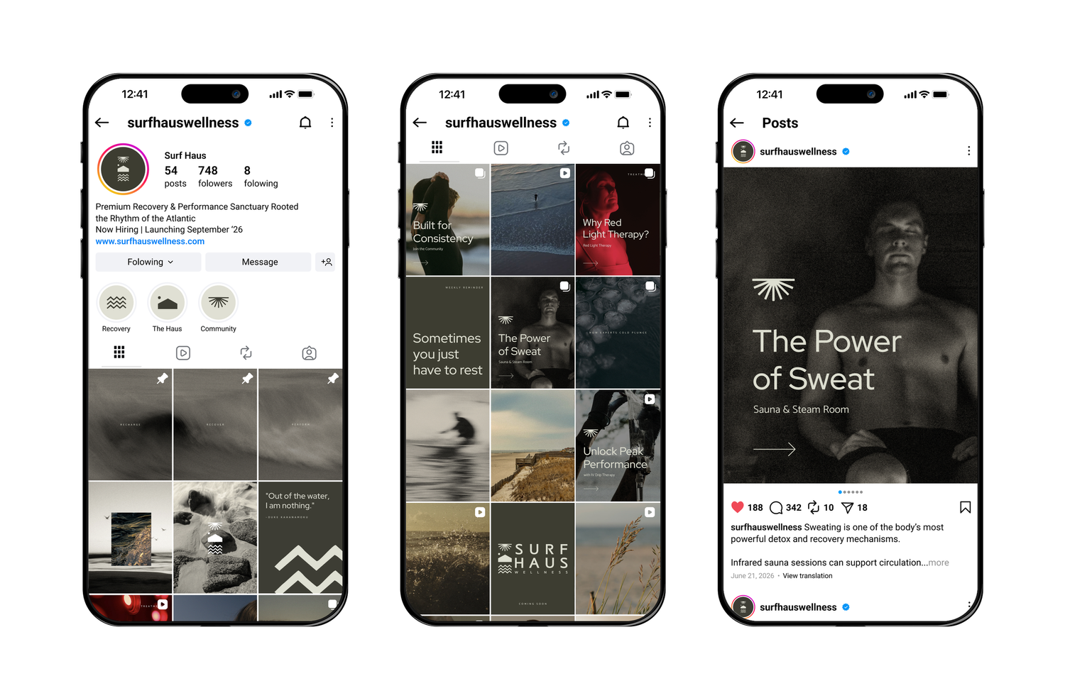
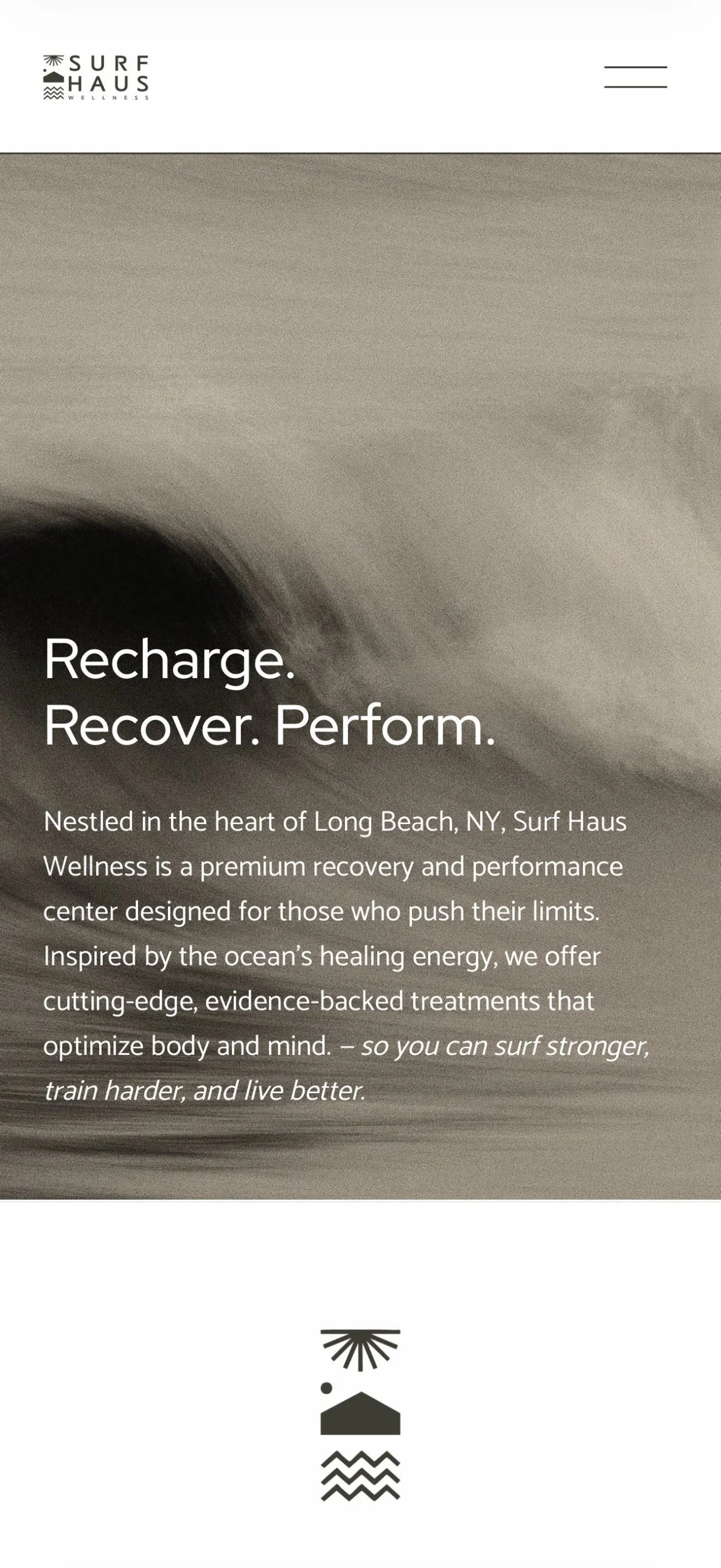
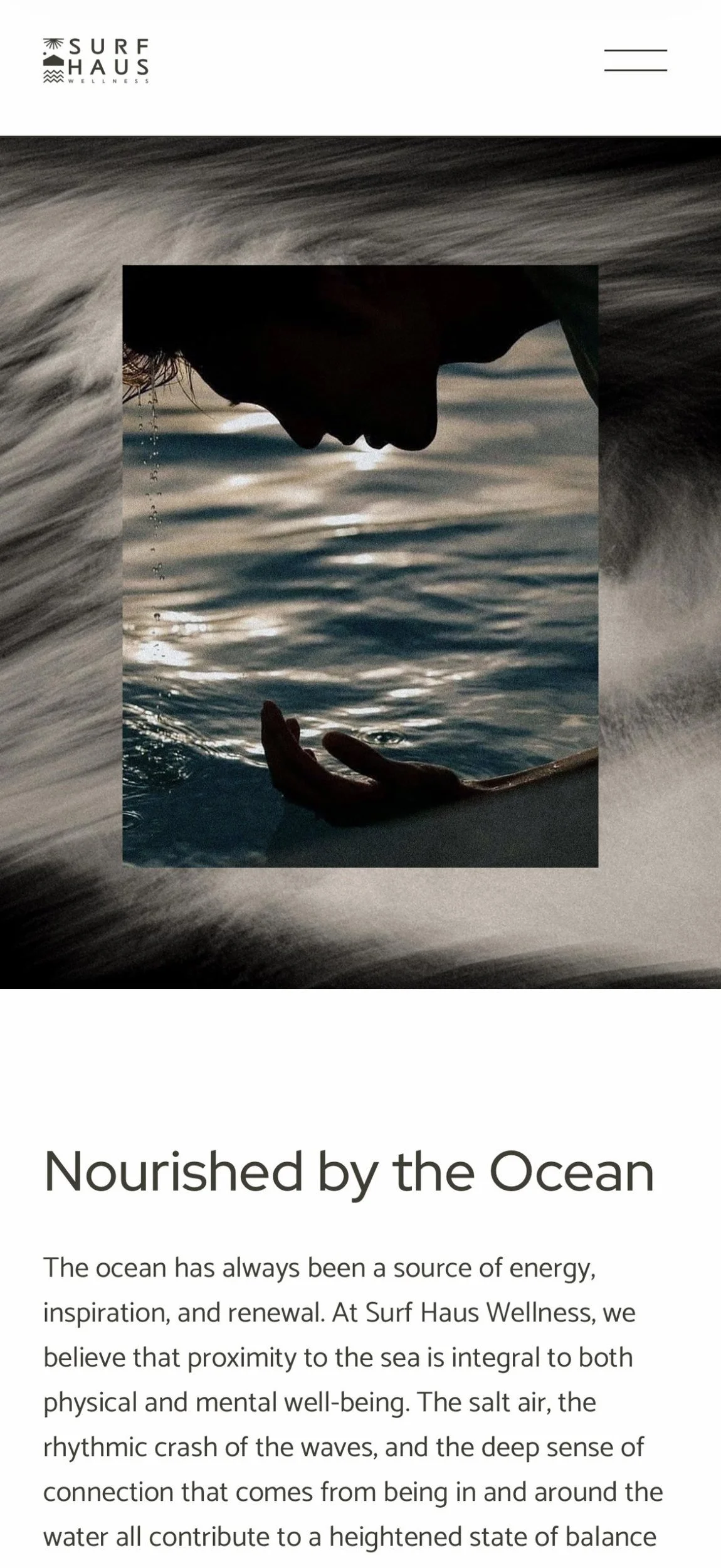
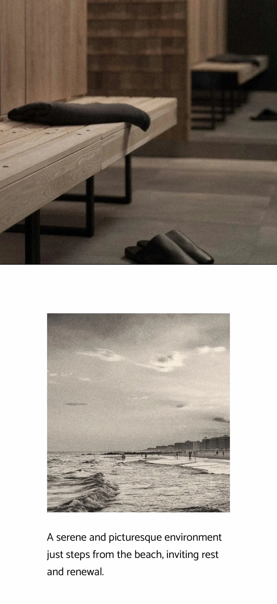
A deep olive and beige palette introduced a grounded, quieter foundation, while grainy, sepia-toned imagery brought texture and a lived-in quality. Headline typography added the directness and energy associated with performance. Together, these choices allowed the emphasis to shift between training and recovery while retaining a consistent visual language.
03
The Website
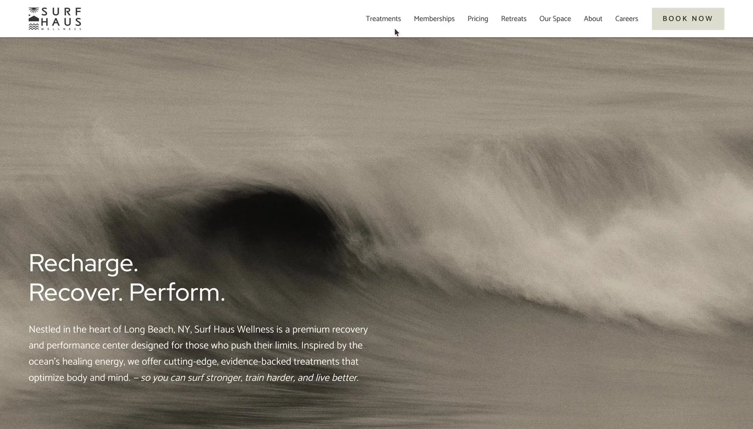
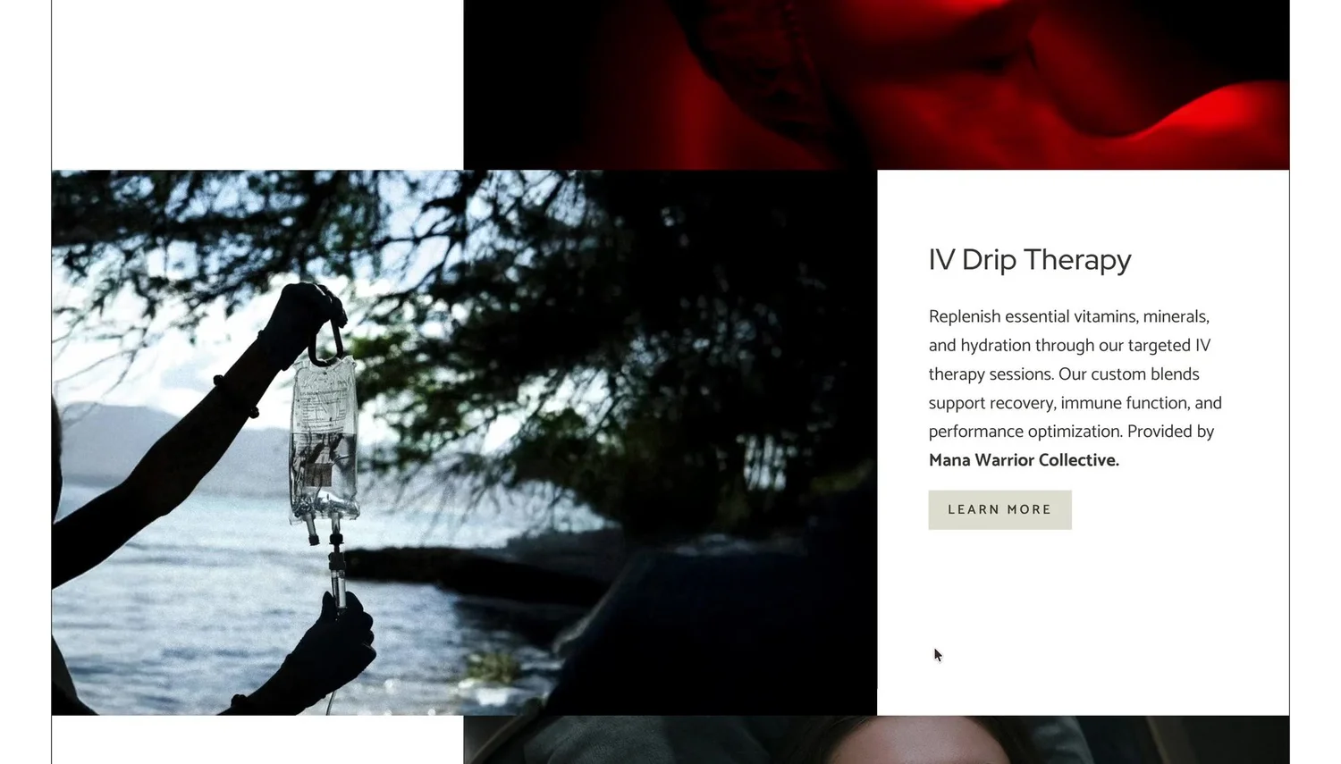
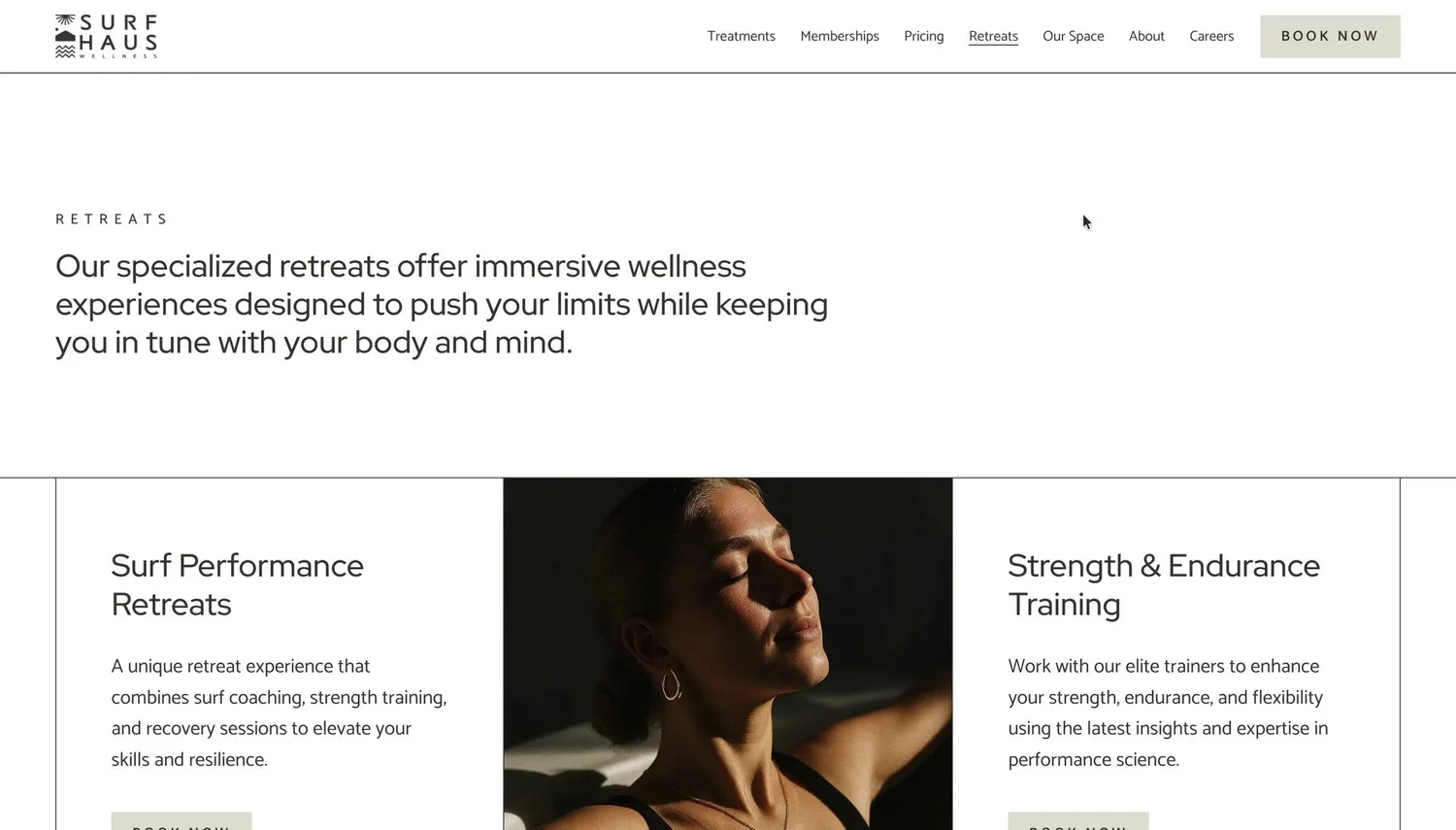
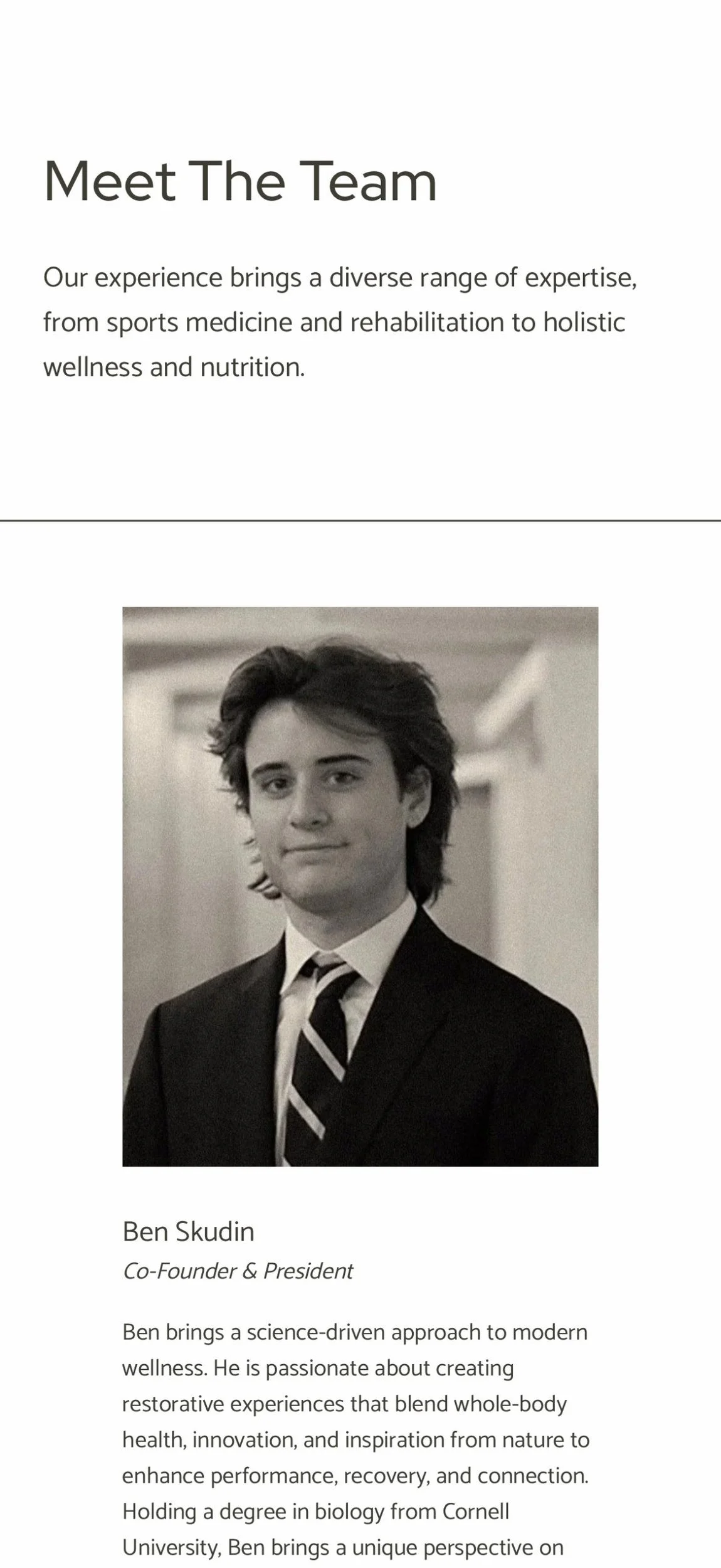
A scroll through the site on desktop, with key screens on mobile.
Closing thought
The identity’s strength lies in the relationship between its elements. Typography carries energy, colour and imagery offer calm, and the house mark gives both a shared sense of place.