
Global Solutions
Many disciplines. One practice.
Overview
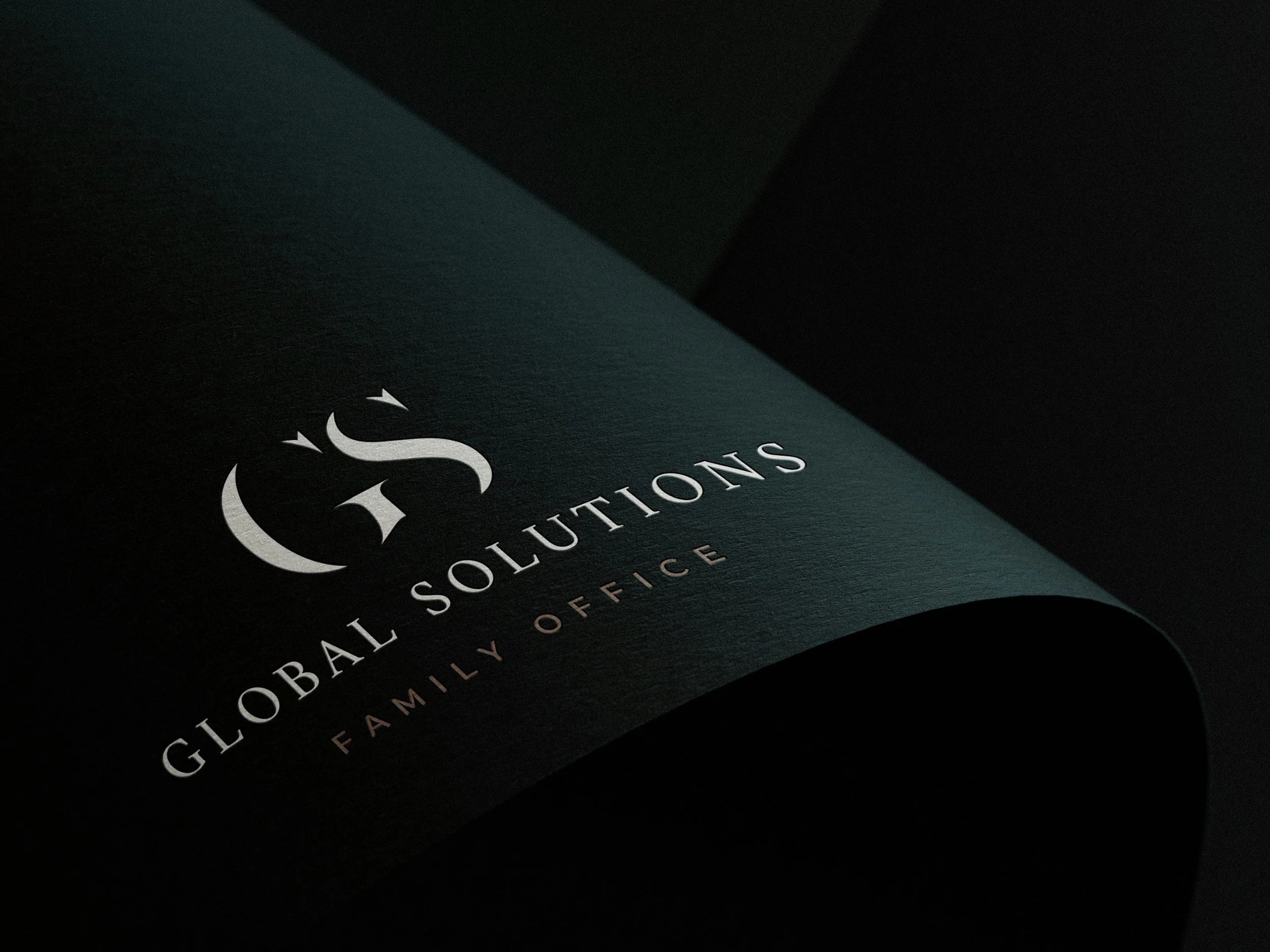
Global Solutions is a Vancouver family office bringing investment, accounting, wealth planning and related expertise together under one roof. The brand refresh gave that breadth a clearer expression across the website, printed materials and office. The task was to communicate the firm’s integrated approach while preserving the familiarity and personal character of an established practice.
Visit the live site (opens in a new tab)
01
The Brief
Global Solutions brings several disciplines into the same client relationship. The brand needed to explain what each contributes and how they work together, making a complex offer easier to understand.
For an established firm, that clarity also had to come with continuity. The refresh needed to reflect the breadth of its capabilities while retaining a sense of familiarity for clients whose relationships with the practice had developed over time.
02
The Idea
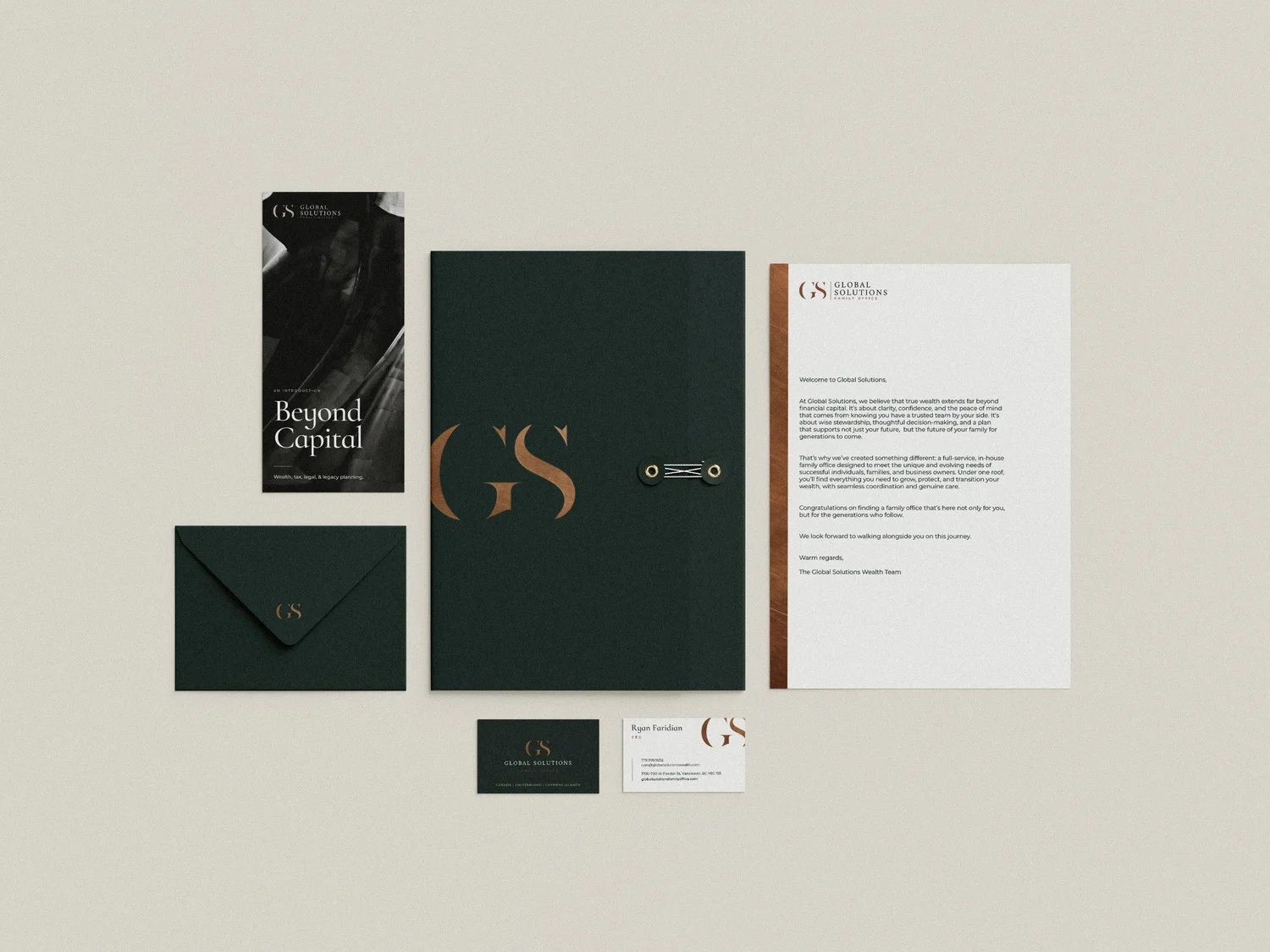
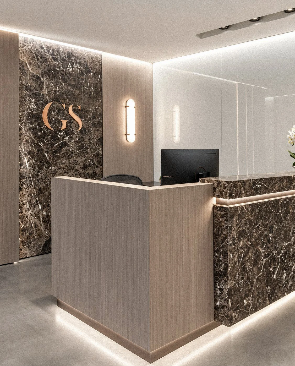
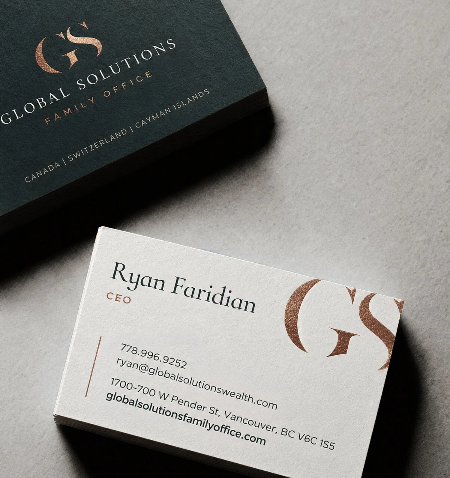
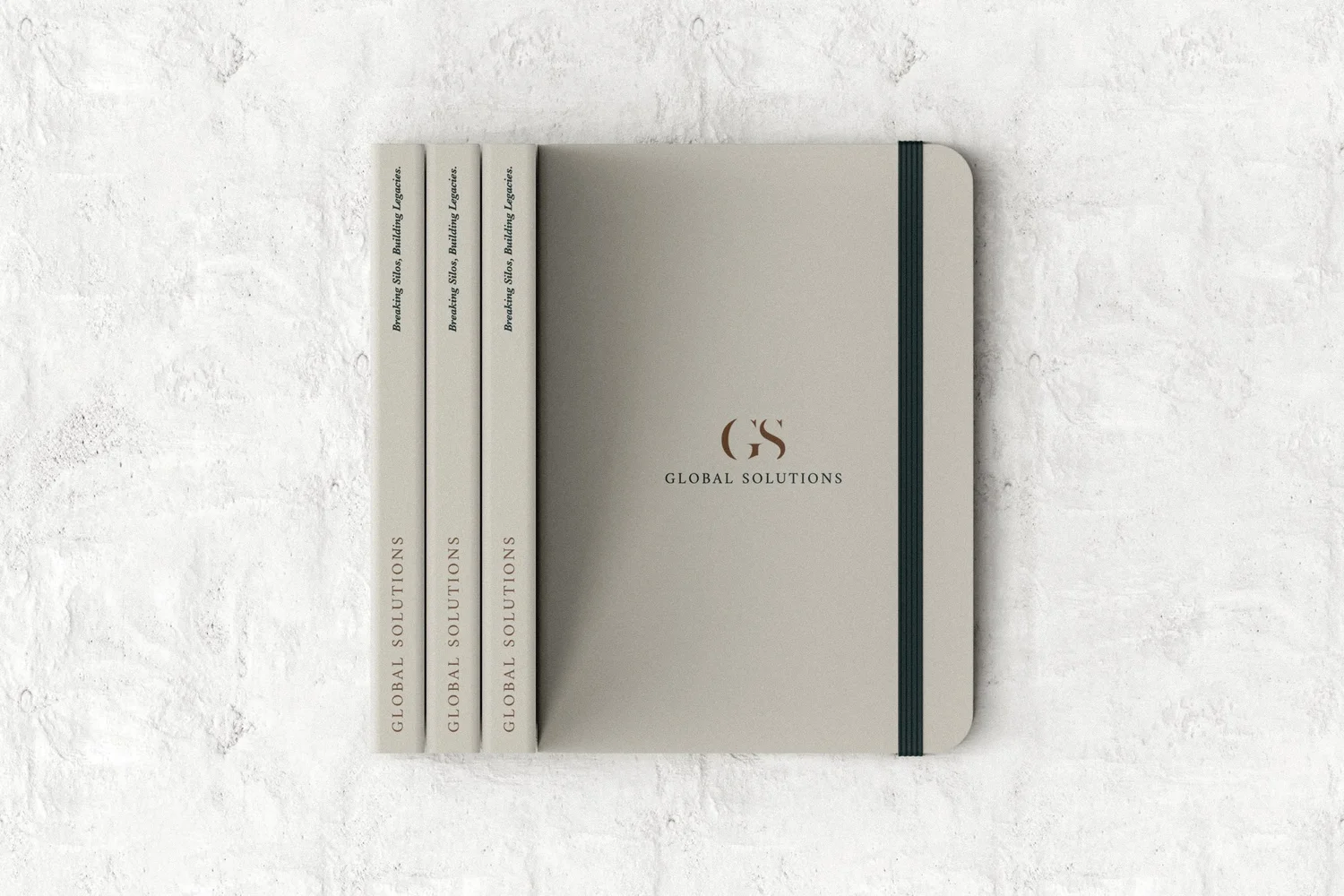
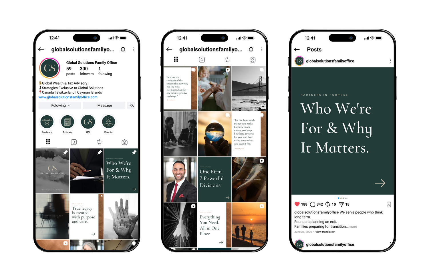
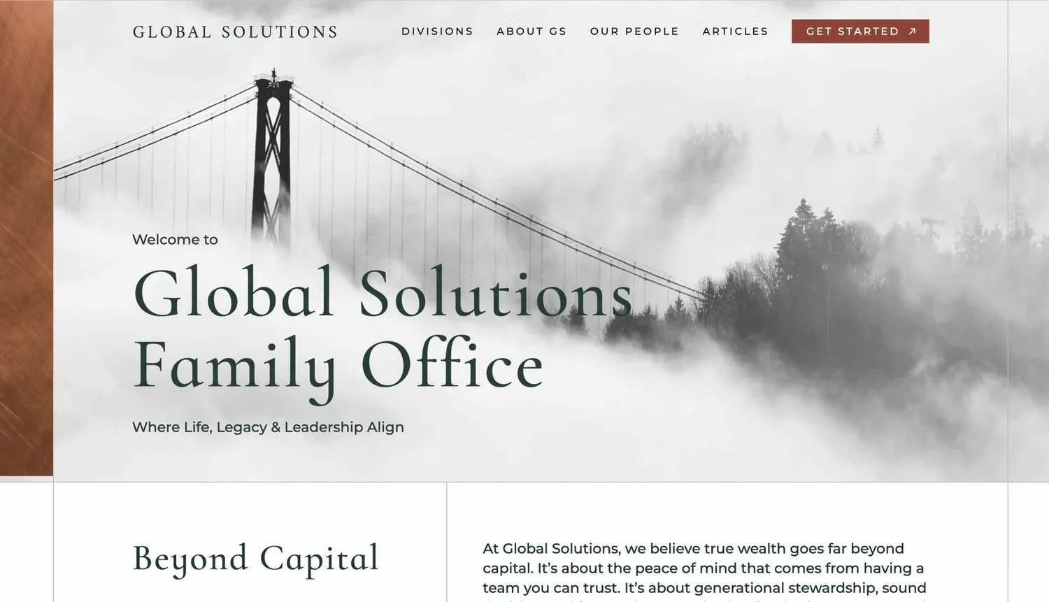
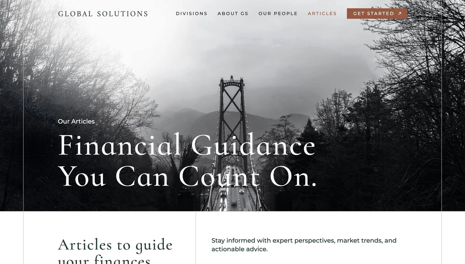
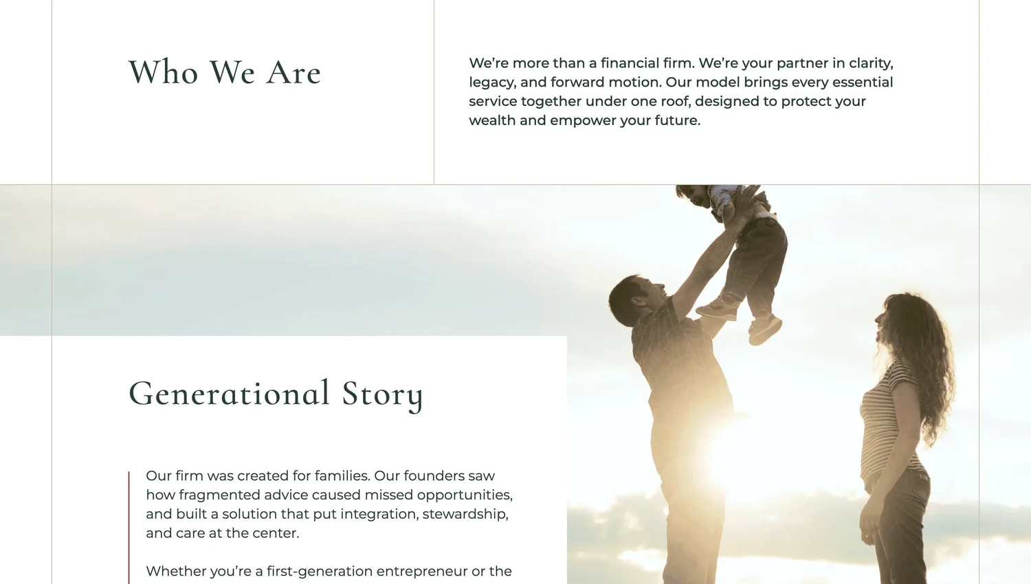
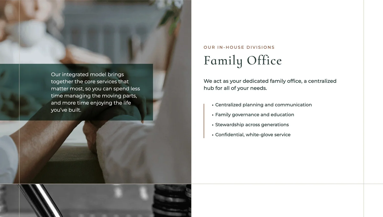
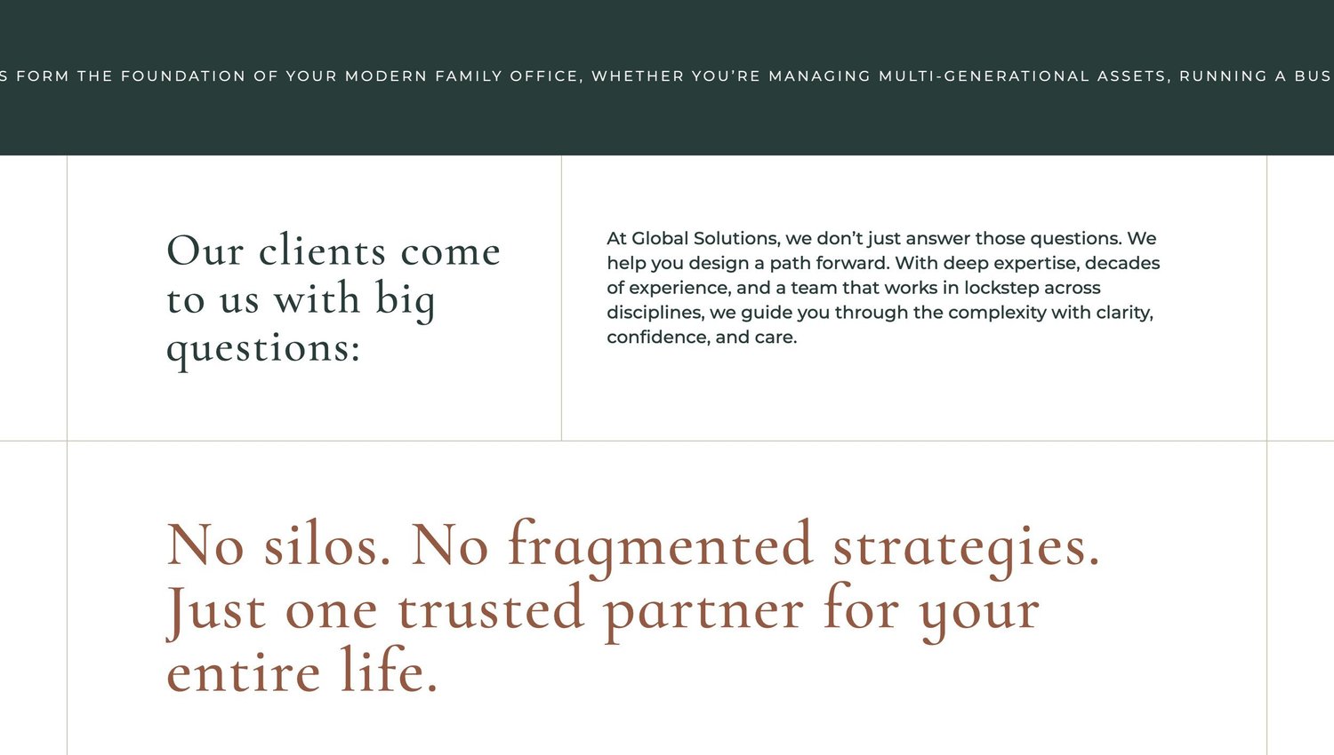
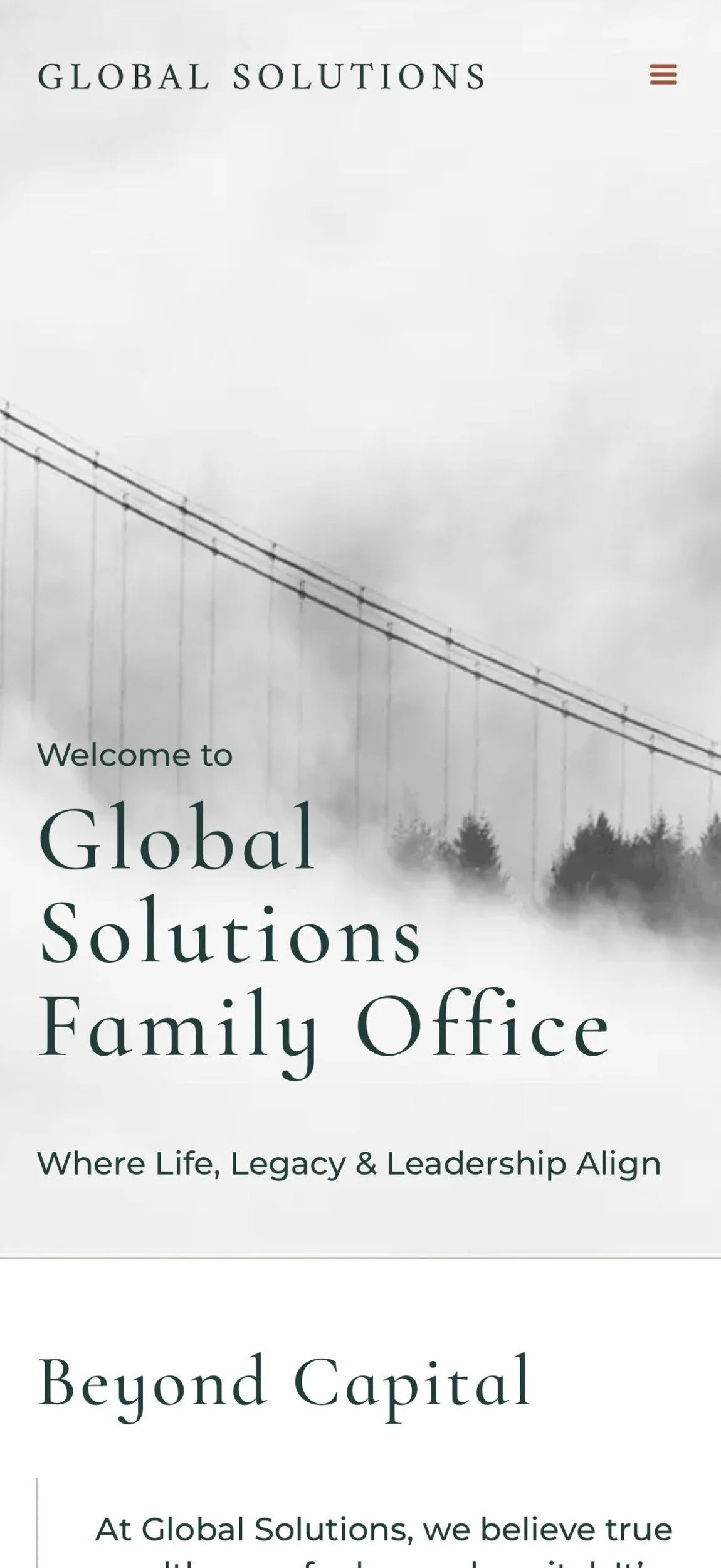
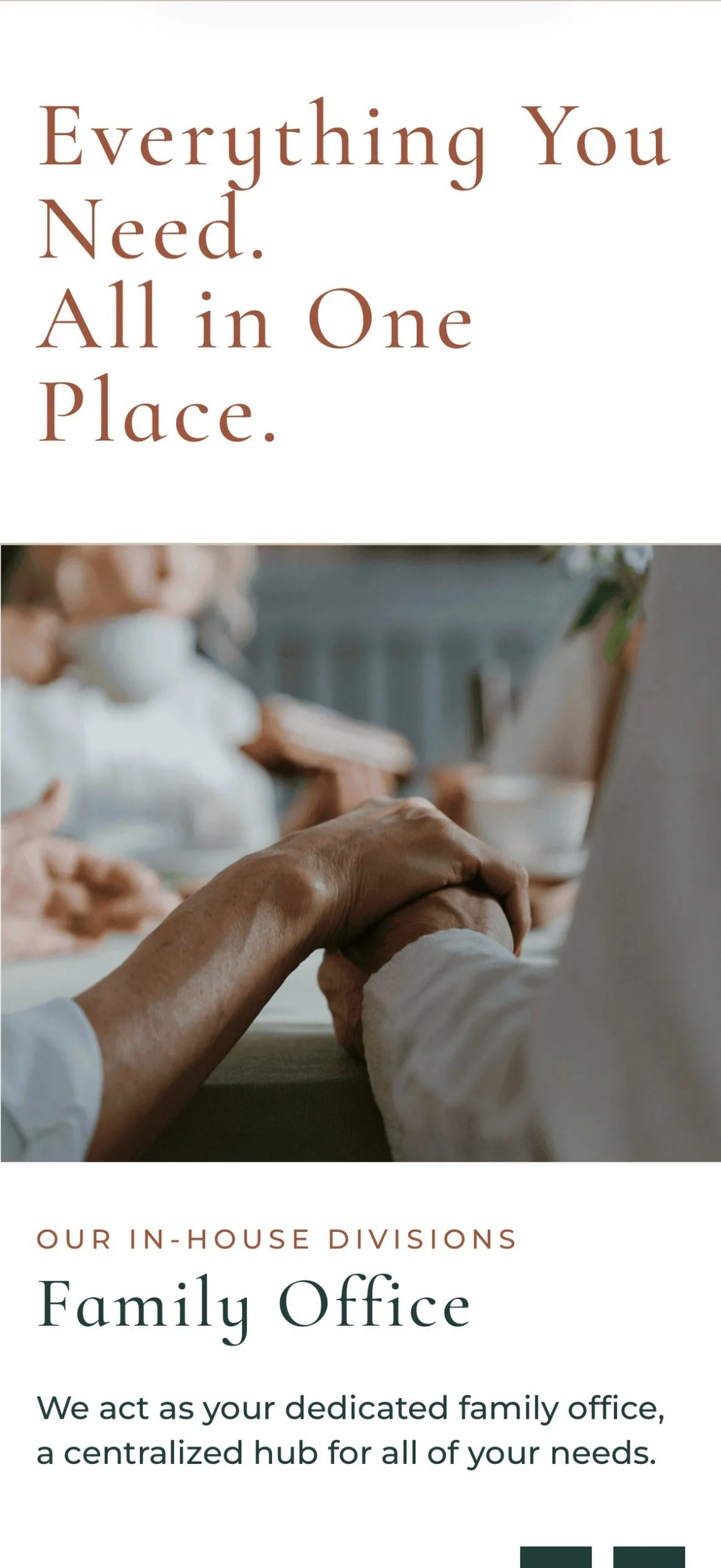
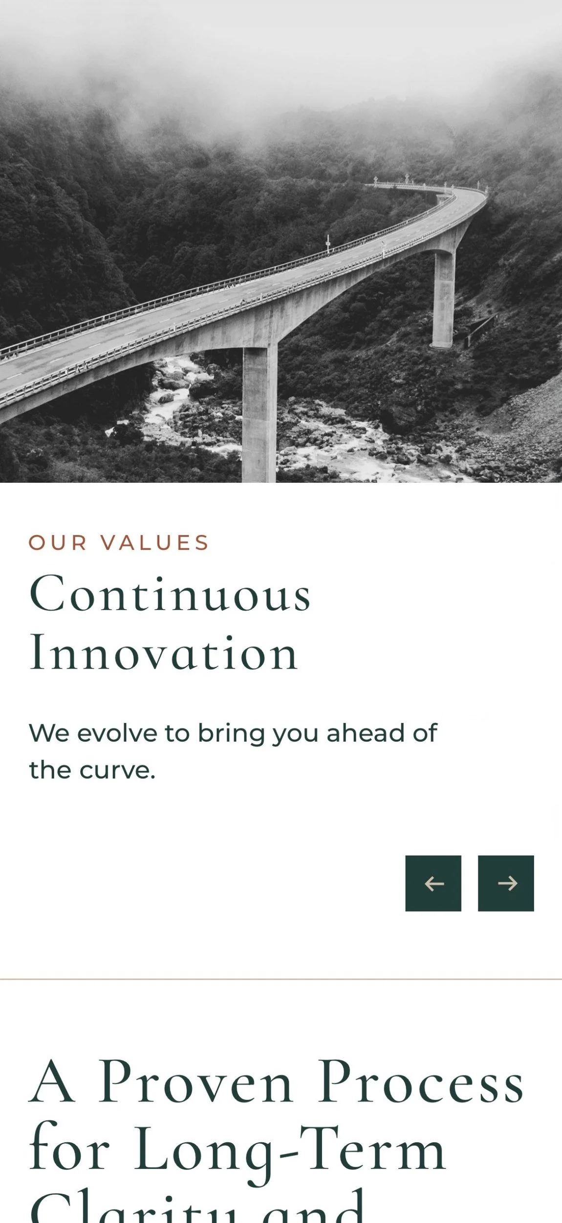
Deep green and warm copper balanced the stature of an established firm with the personal nature of its advice. Serif headings brought character and continuity, while clean sans-serif typography and generous spacing kept the layouts composed.
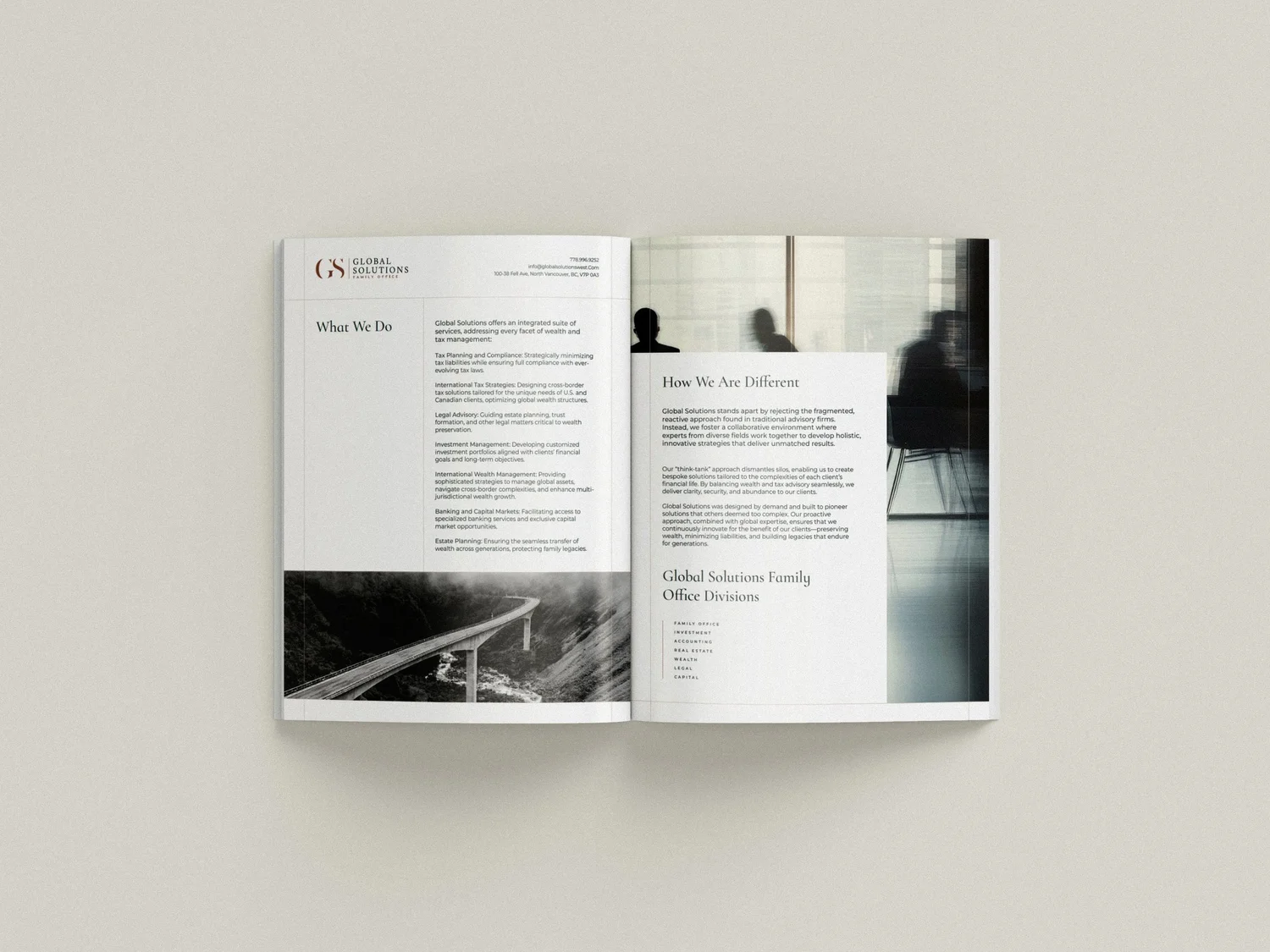
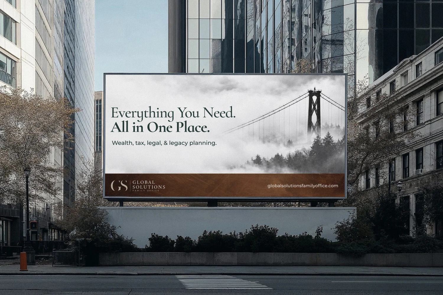
Fine rules gave the grid definition, holding distinct sections within a shared structure that echoed the firm’s integrated approach. Across the website, print and signage, this became a visual language for many disciplines operating as one practice.



03
The Website
A scroll through the site on desktop, with key screens on mobile.

Closing thought
A shared visual language gave the firm’s many disciplines a collective presence, while preserving the familiarity of an established practice.