
Ra Body
A place to root, rise and radiate.
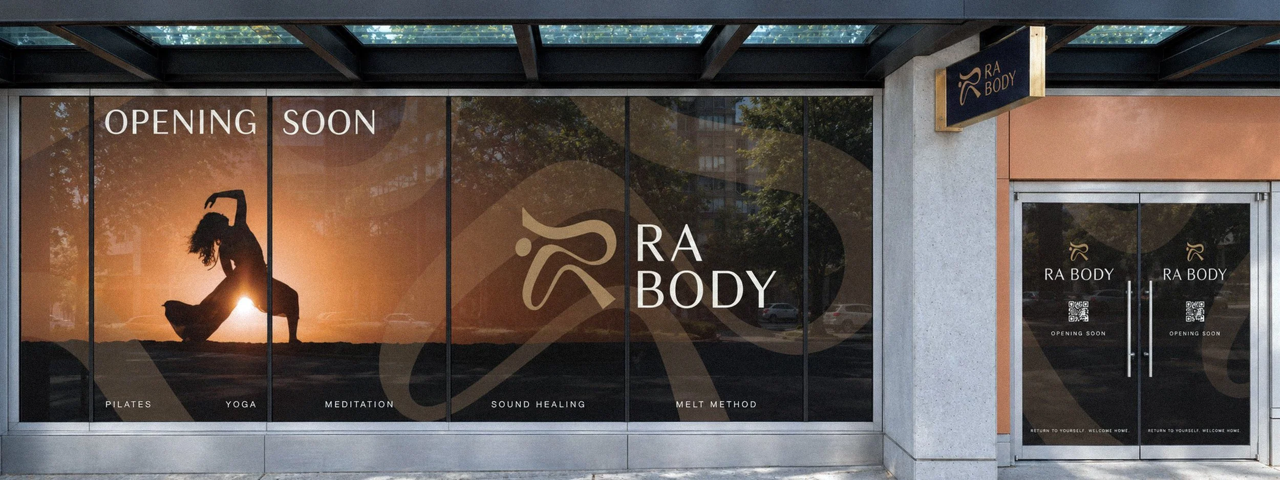
Overview
Ra Body is a Vancouver studio offering yoga, Pilates, meditation, sound healing and MELT. Created ahead of opening, the identity drew on the founder’s heritage and her connection to Ra, the Egyptian sun god. Movement and the changing qualities of light became the link between that personal story and the experience of the studio.
01
The Brief
The founder’s story gave Ra Body a meaningful starting point. The identity needed to carry that cultural connection while expressing the physical experience of the studio: movement, energy and moments of stillness.
Within a short launch timeline, the task was to establish a visual language that could bring these qualities together across the storefront, signage and website. It needed to feel distinct and recognizable while accommodating a varied program of practices.
02
The Idea
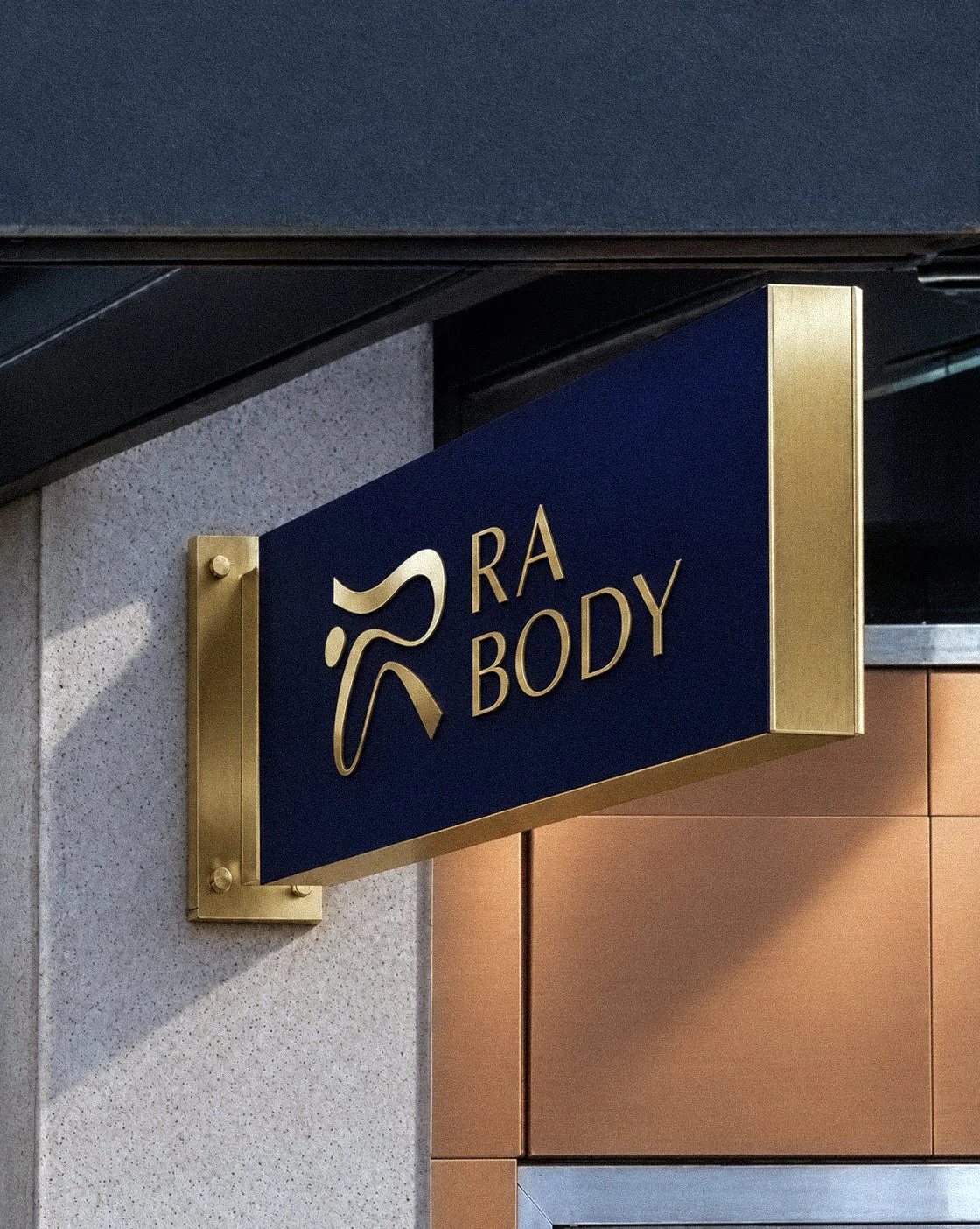
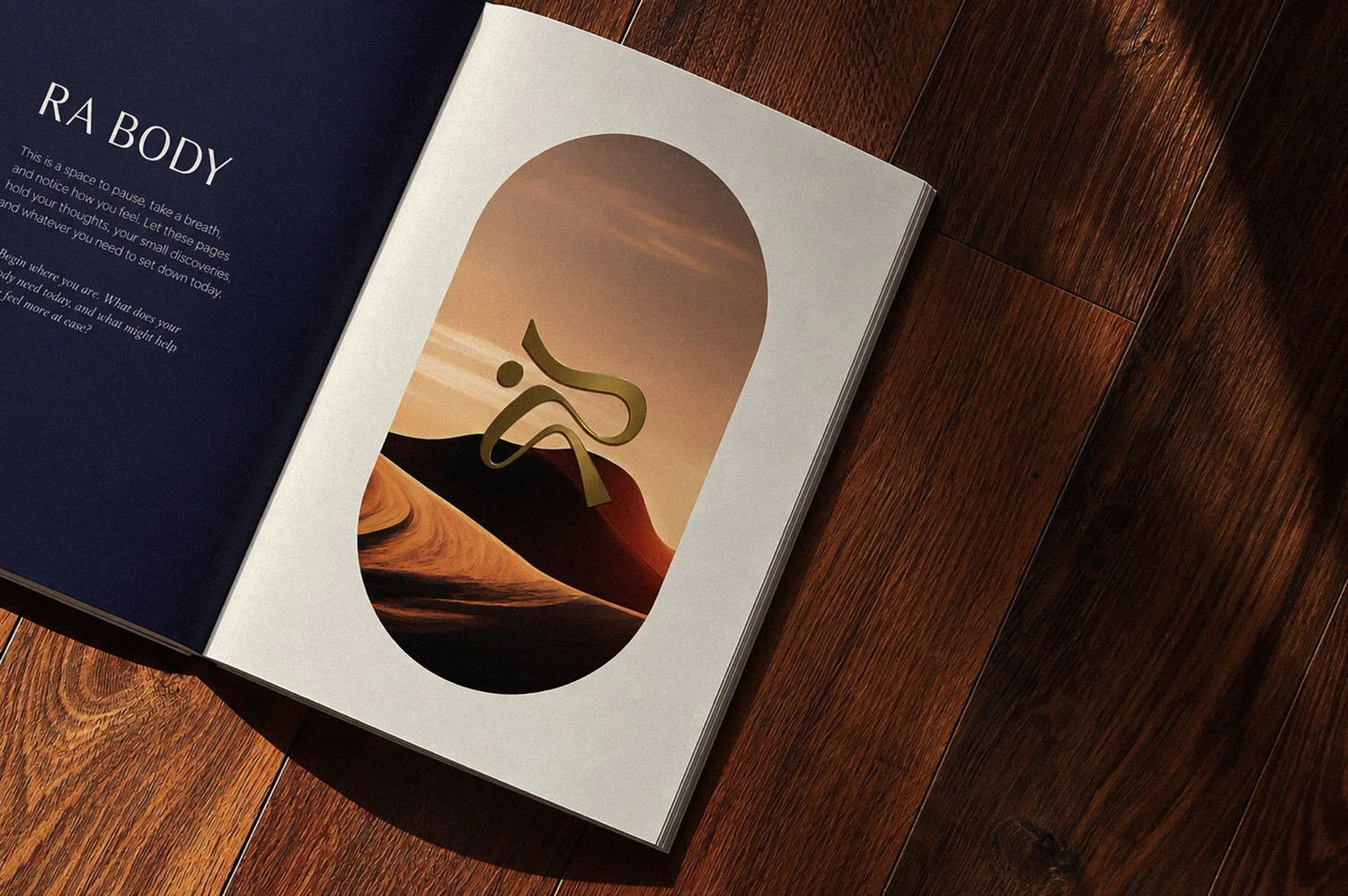
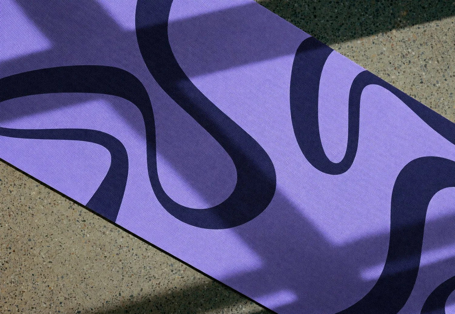
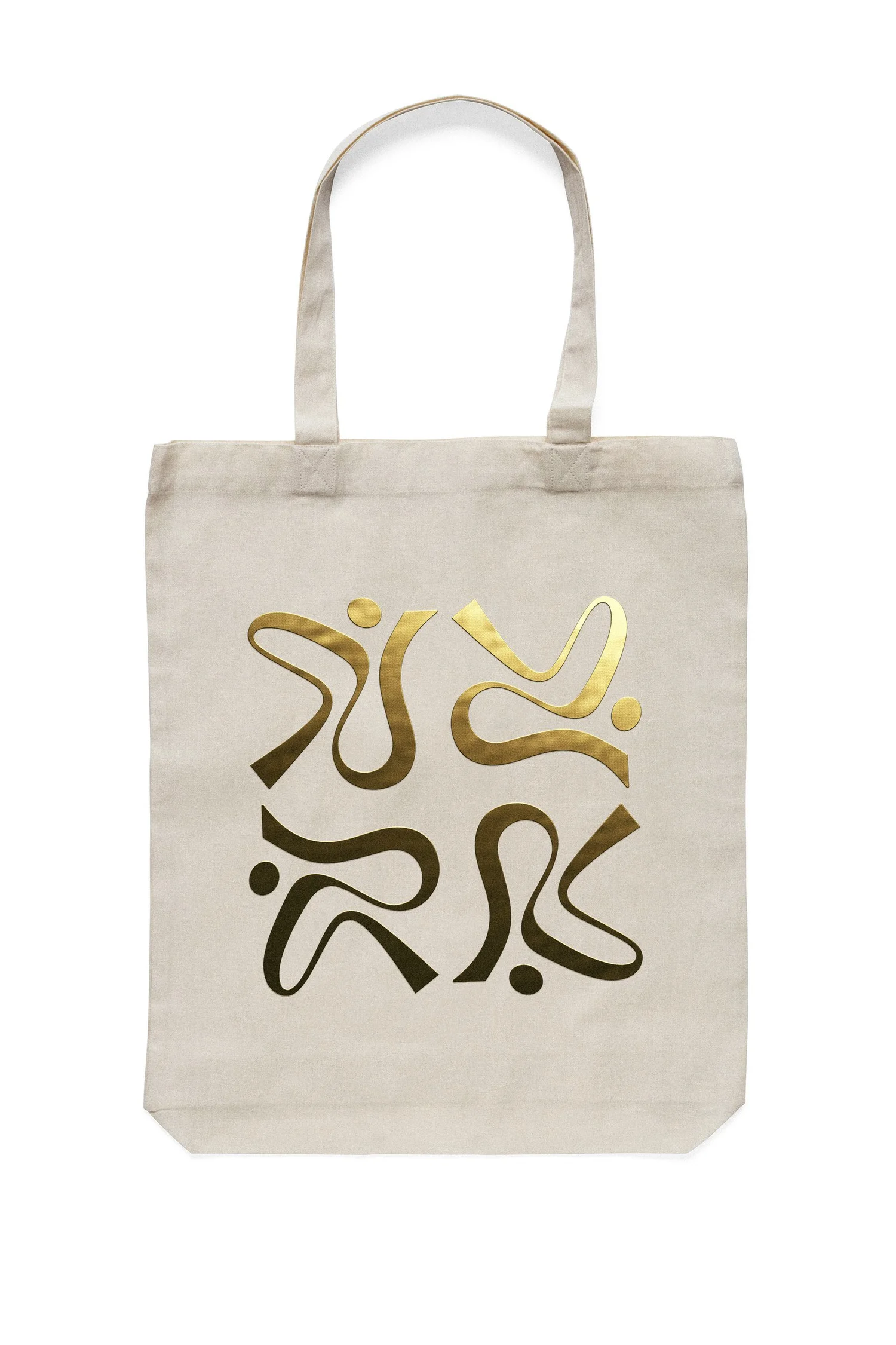
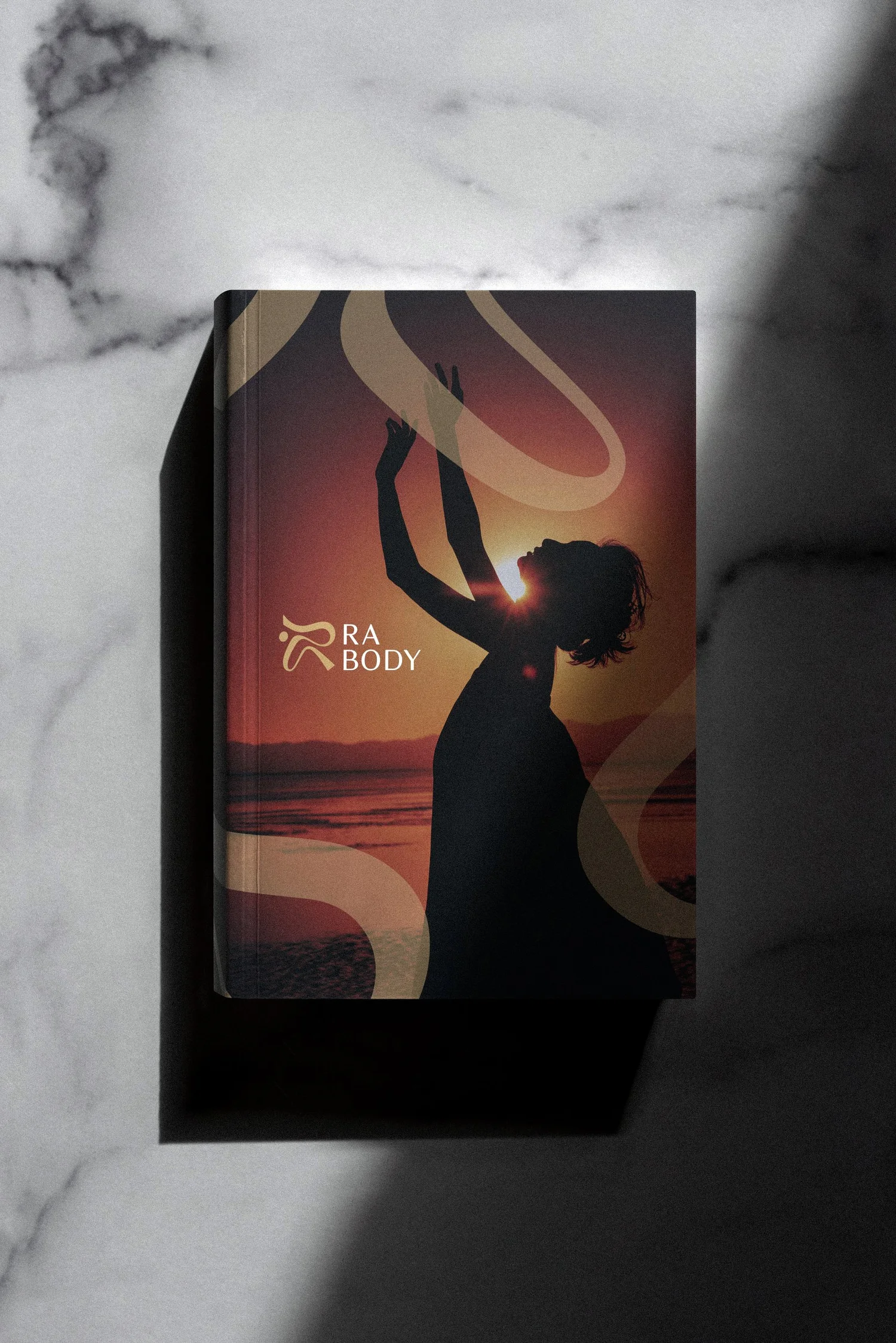
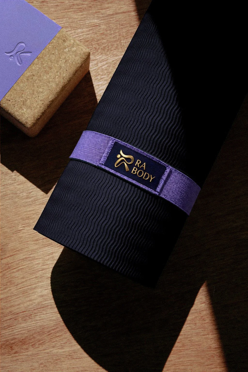
The mark brings the letters R and A into a fluid, gestural form that reads as a body in motion. A circle suggests both the head and the sun, while the flowing line allows further readings of a river and the movement of Ra. These references share a sense of continuity, giving the mark layers of meaning within a simple form.
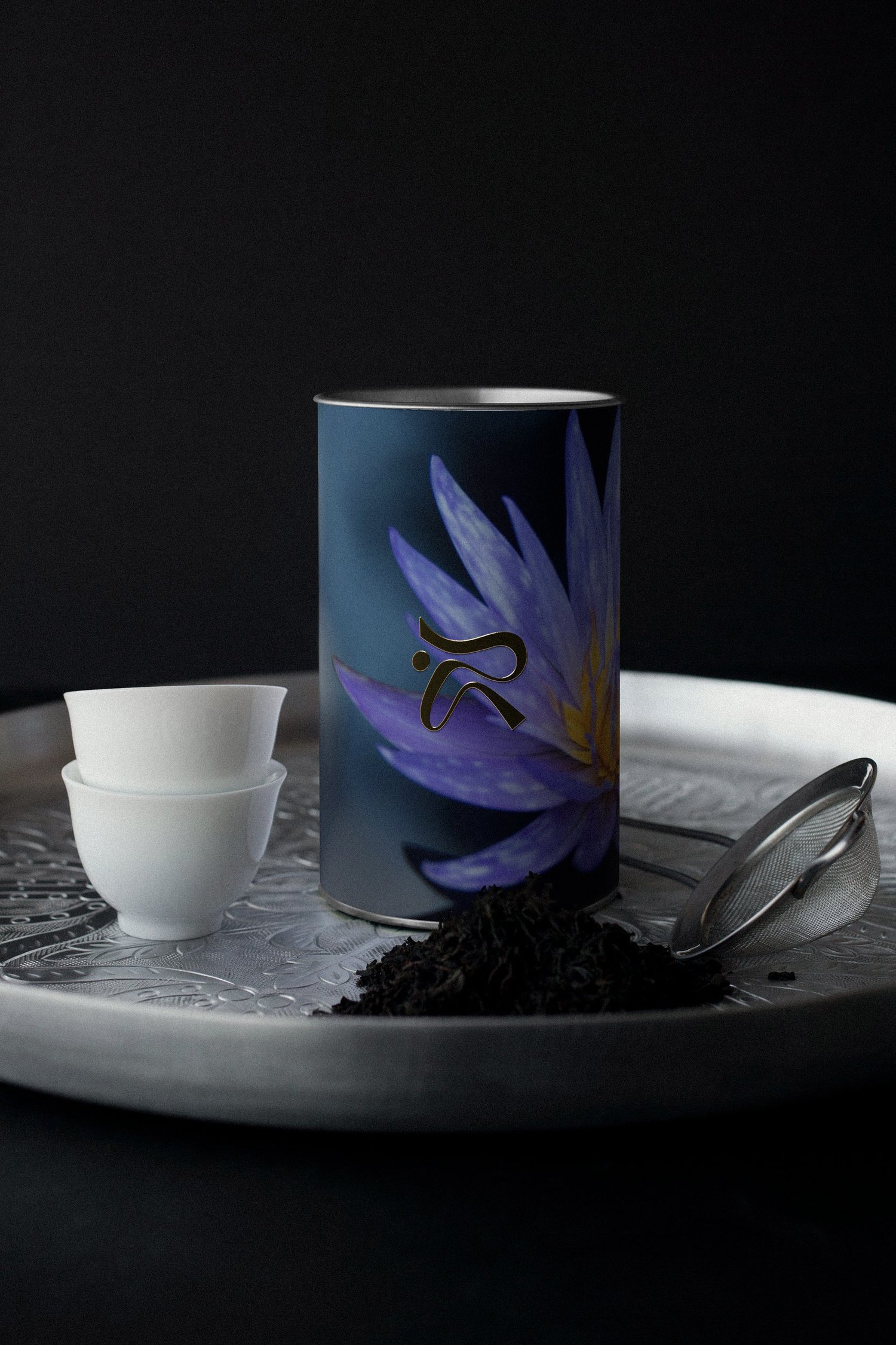
The palette draws on the warmth of golden hour and the stillness of blue hour. Warm taupe and ivory sit alongside deep indigo and soft periwinkle, with references to lapis lazuli and the Egyptian lotus extending the connection to the founder’s heritage. Paired with imagery of light and movement, the colours allow the identity to express both energy and calm.
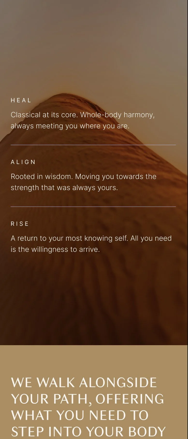
Root, Rise and Radiate carried the concept into the studio’s class levels, making the language of the brand part of the practice itself.
03
The Website
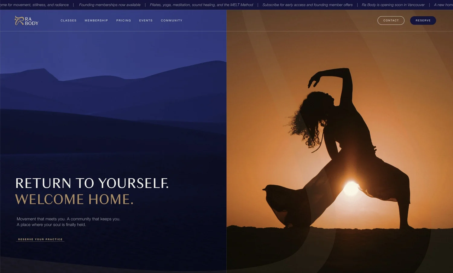
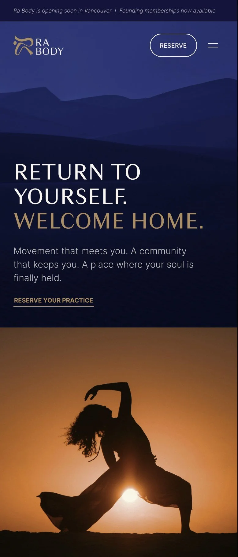
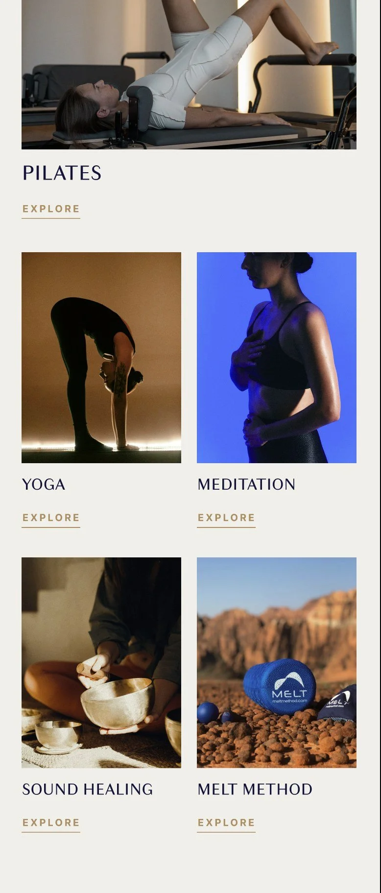
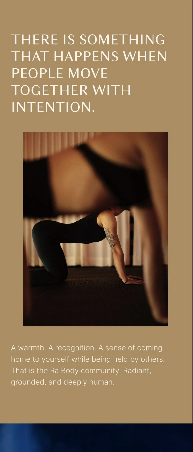
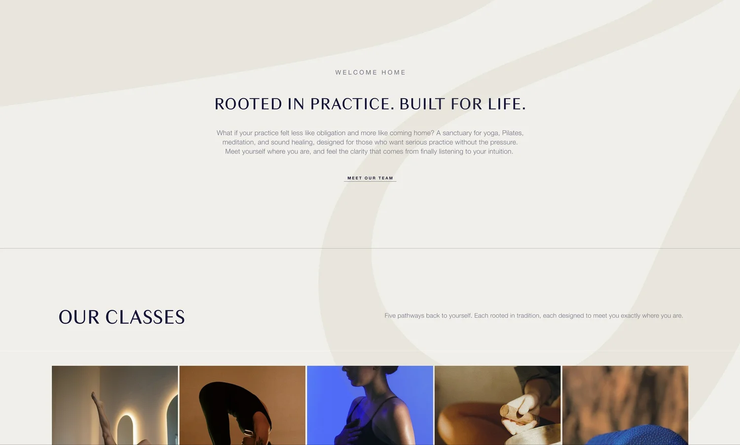
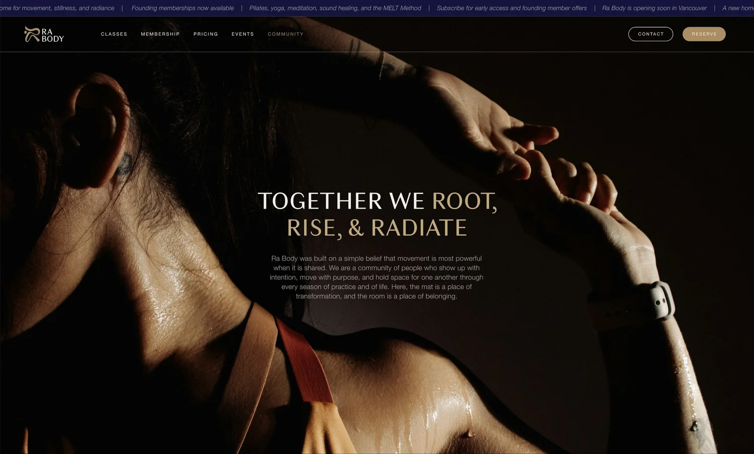
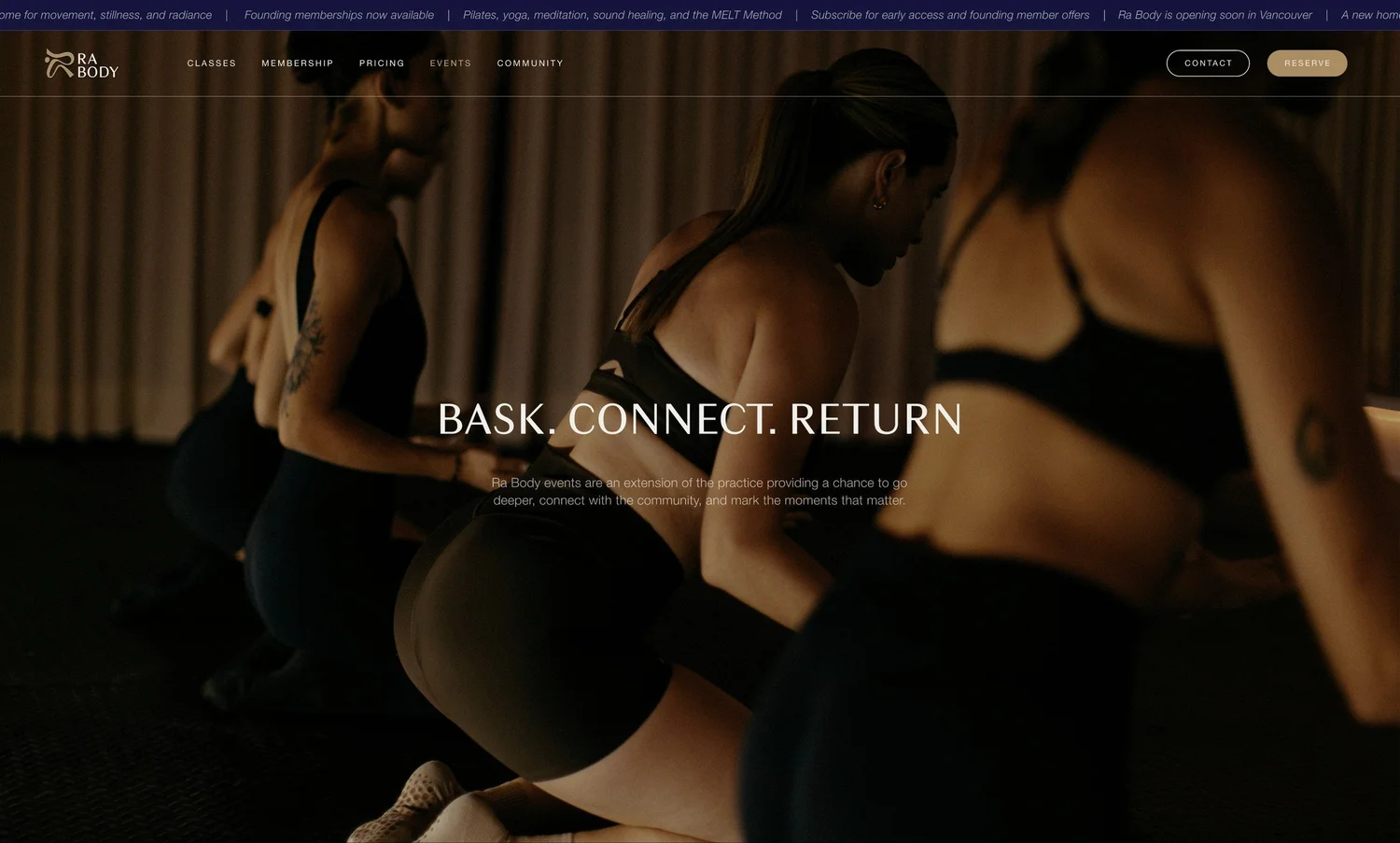
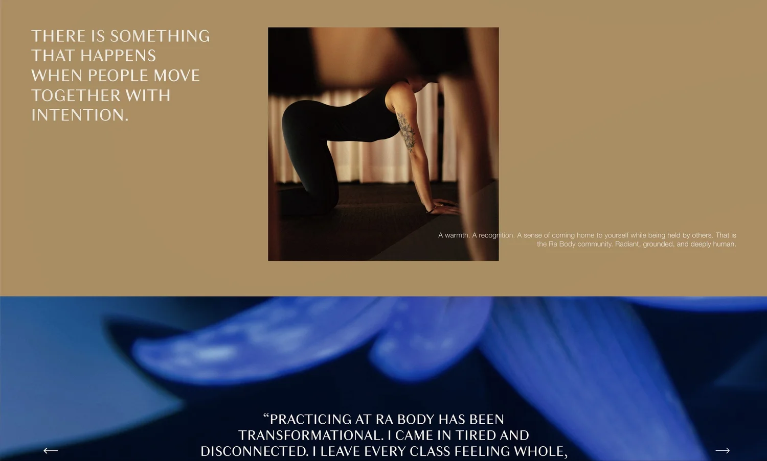
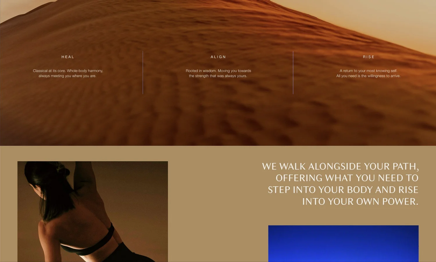
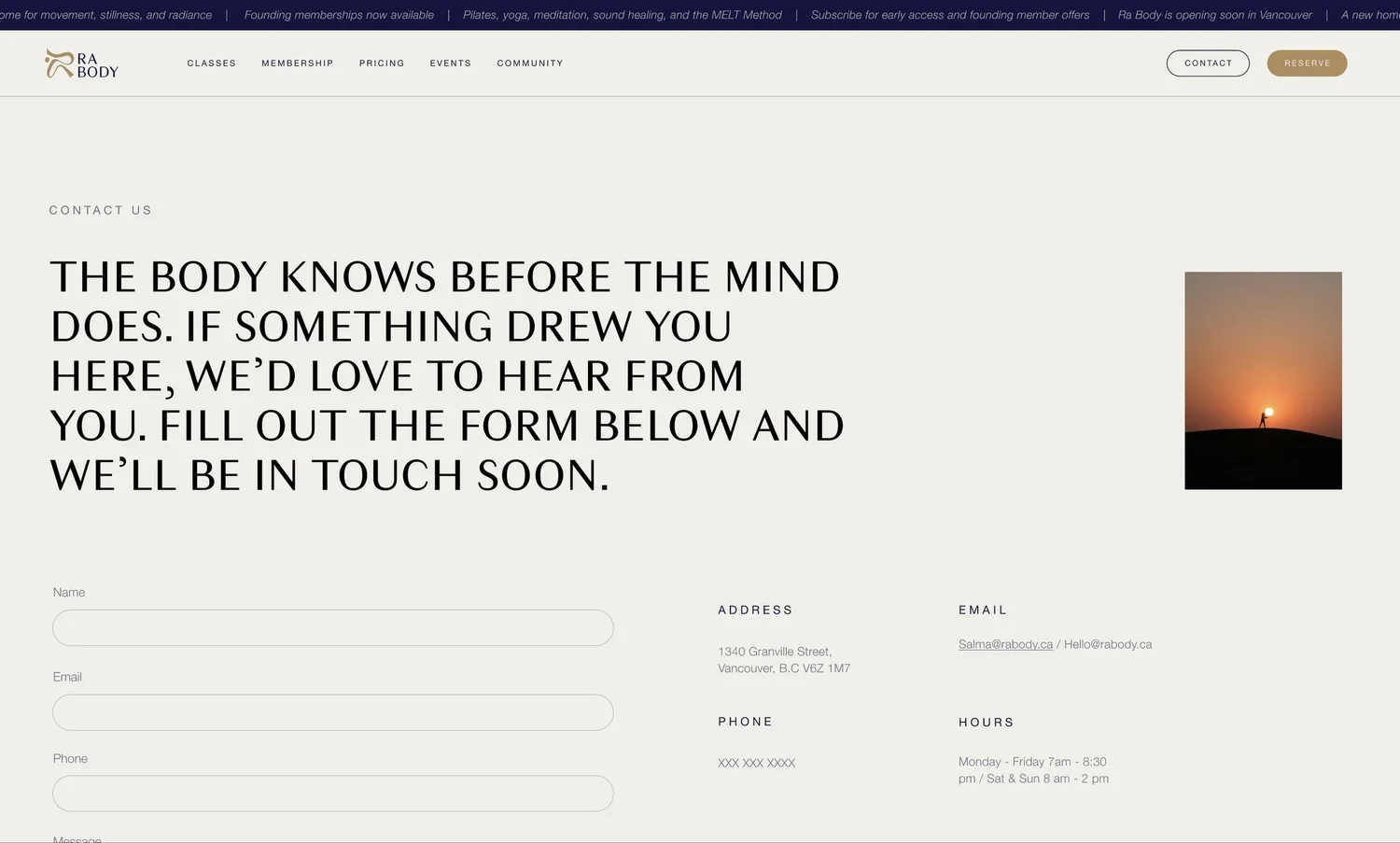
Key screens from the site on desktop and mobile.
Closing thought
Movement gave the founder’s story a shared language, connecting the mark, palette and class names with the experience of the studio.