Slow Burn: FW23
SLOW BURN: FW23
Art Direction, Brand Identity, Graphic Design
Credits:
Lifestyle Photography: Luis Valdizon; Design Collaborators: Ryan Boechler
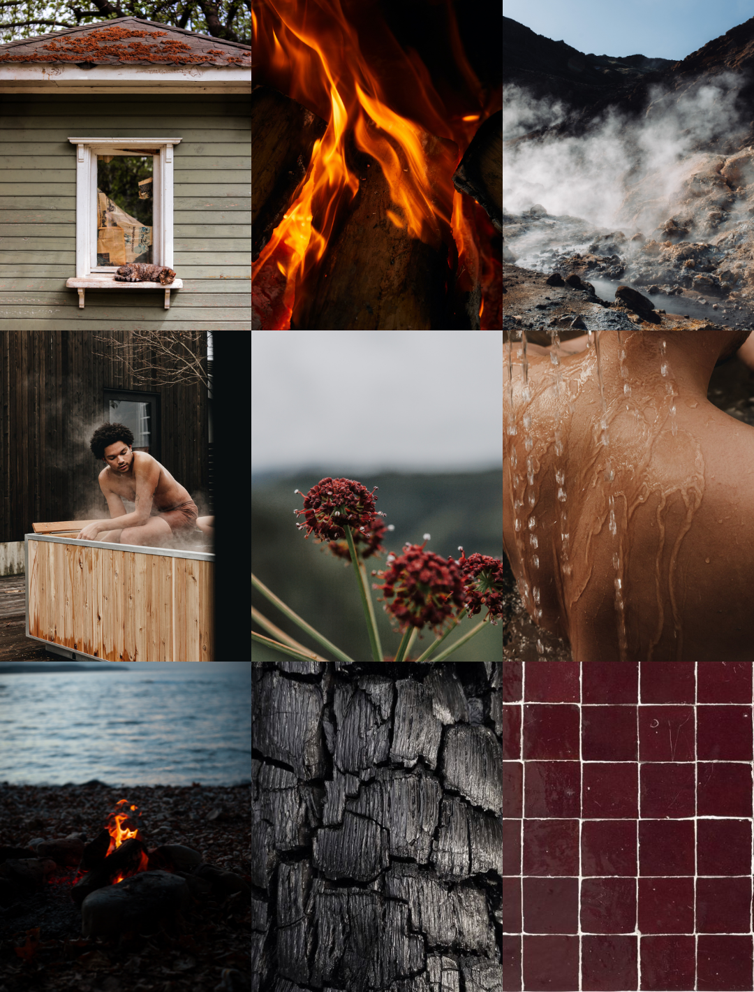
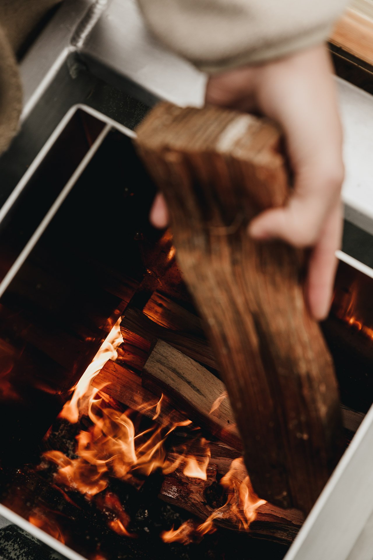
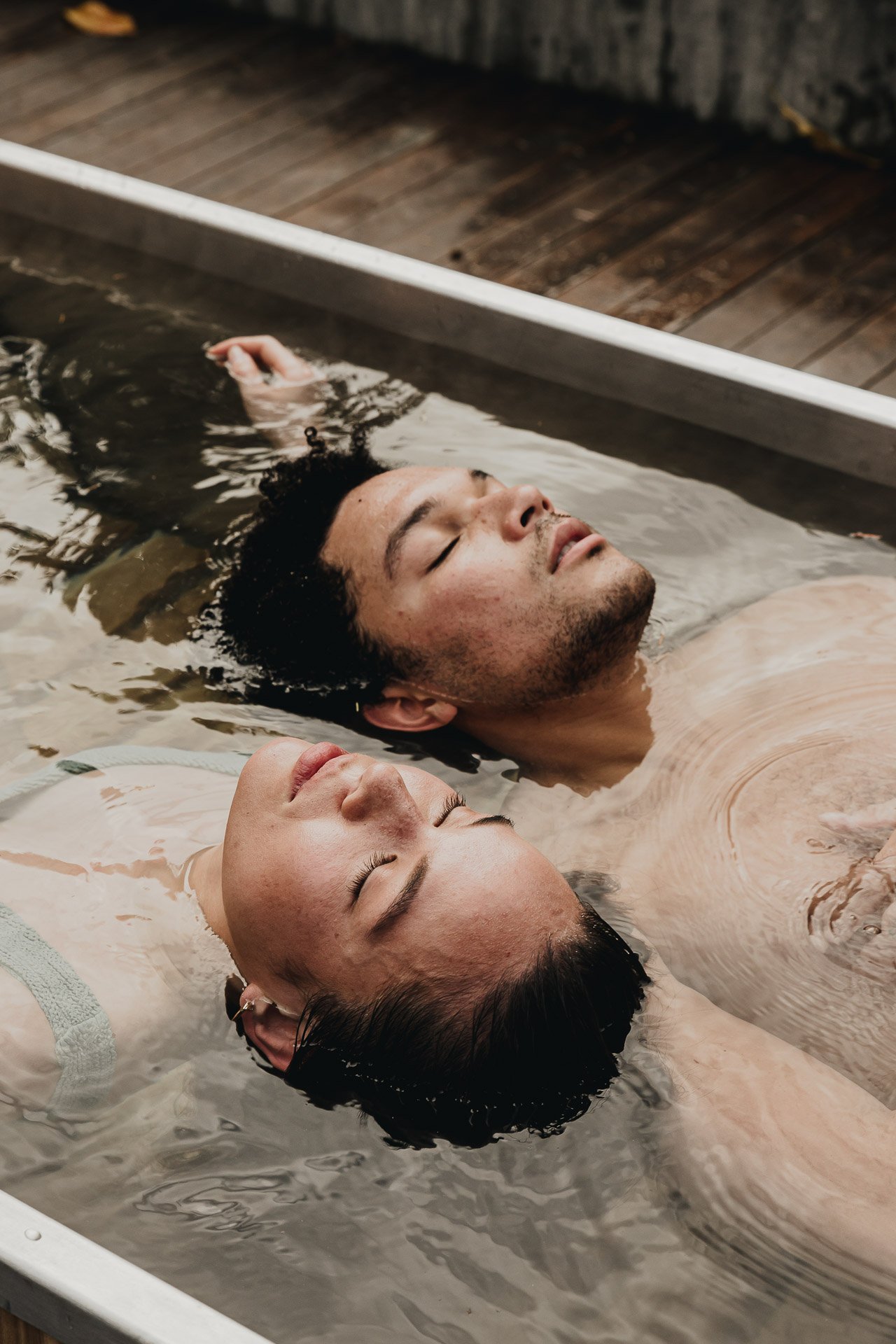
Embracing the core of Goodland’s FW23 campaign, "Slow Burn," we explore life's richness through the practice of patience and pace, mirroring the gradual glow of a slow-burning candle. Encouraging this deliberate slowing down, Goodland products foster an appreciation for time. The theme extends to the literal act of crafting warmth, harmonizing seamlessly with Goodland’s Woodburning Hot Tub.
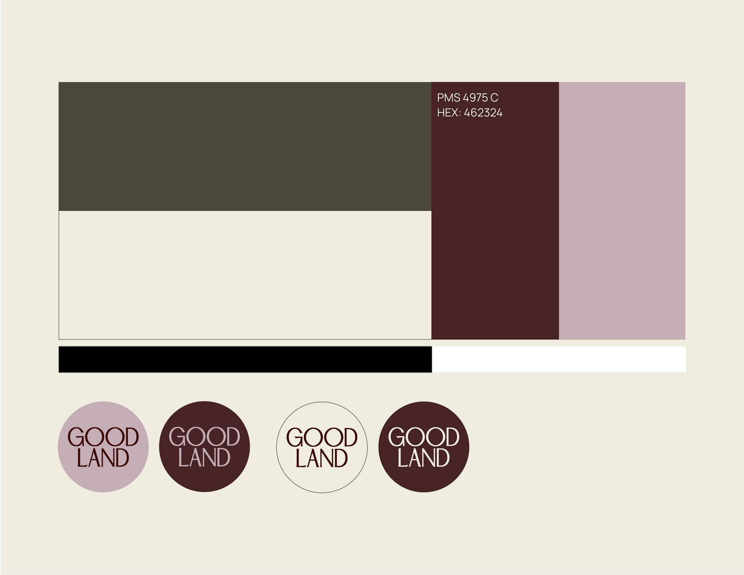
Colour: Umber, a cool-toned maroon, symbolizes warmth without overpowering heat—a representation of a slow-burning flame.
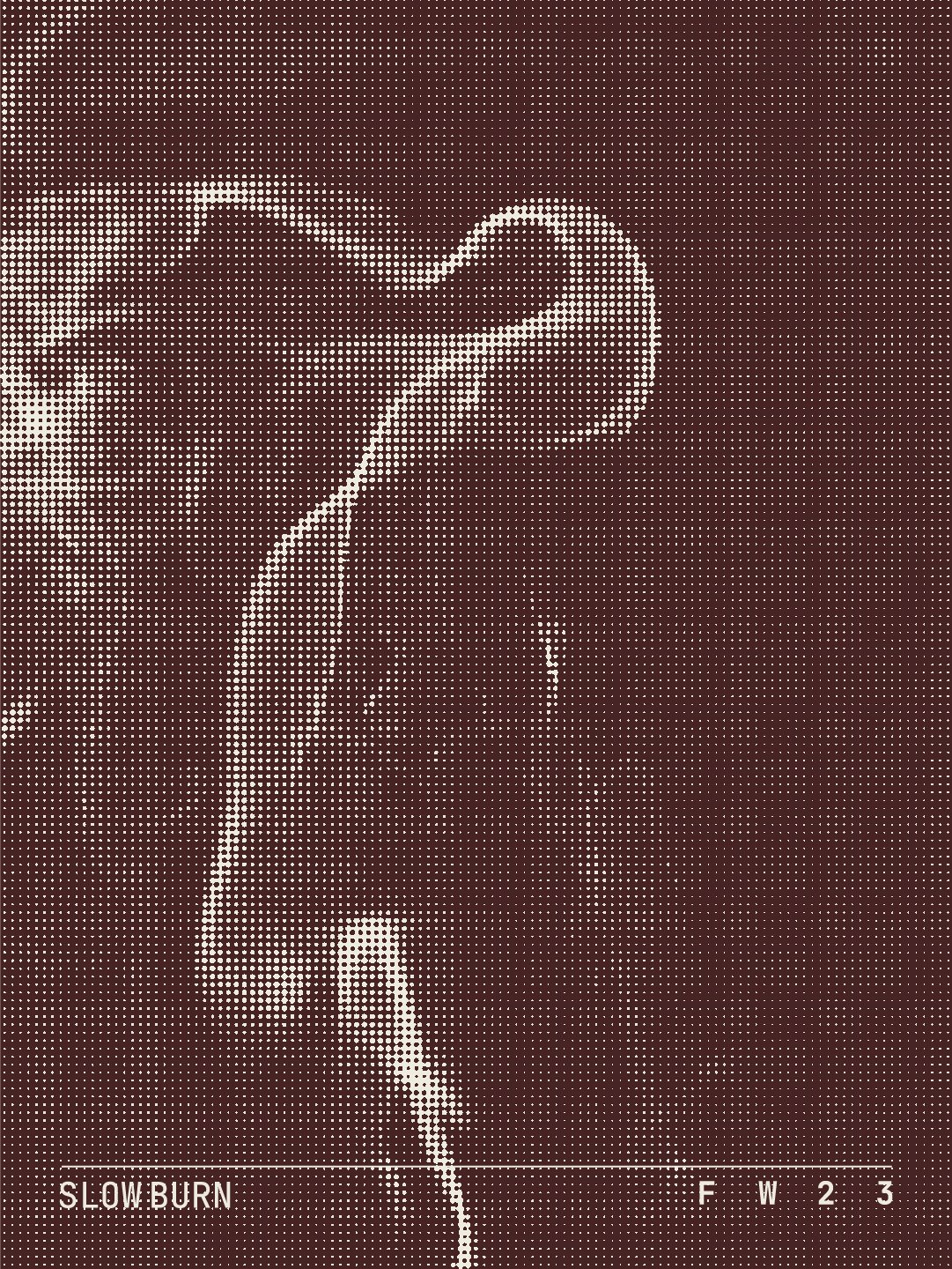
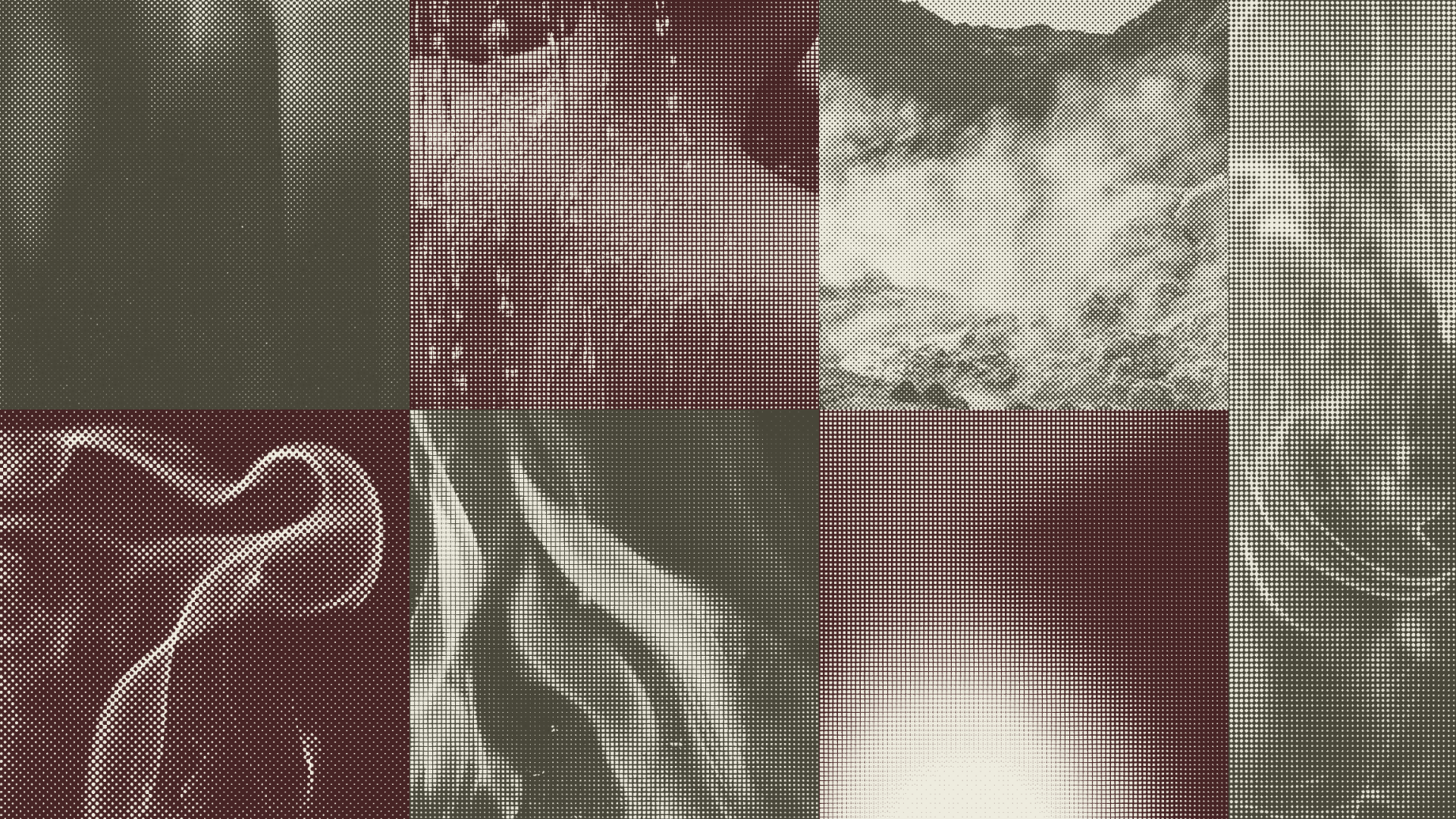
Graphics: Aligned with the Nordic cycle, the campaign emphasizes temperature control for enhanced well-being. Notably, I contributed hand-painted and halftone graphics, enriching Goodland's digital presence across social media, the website, and various platforms, effortlessly reflecting the intentional pacing and warmth of the Slow Burn theme.
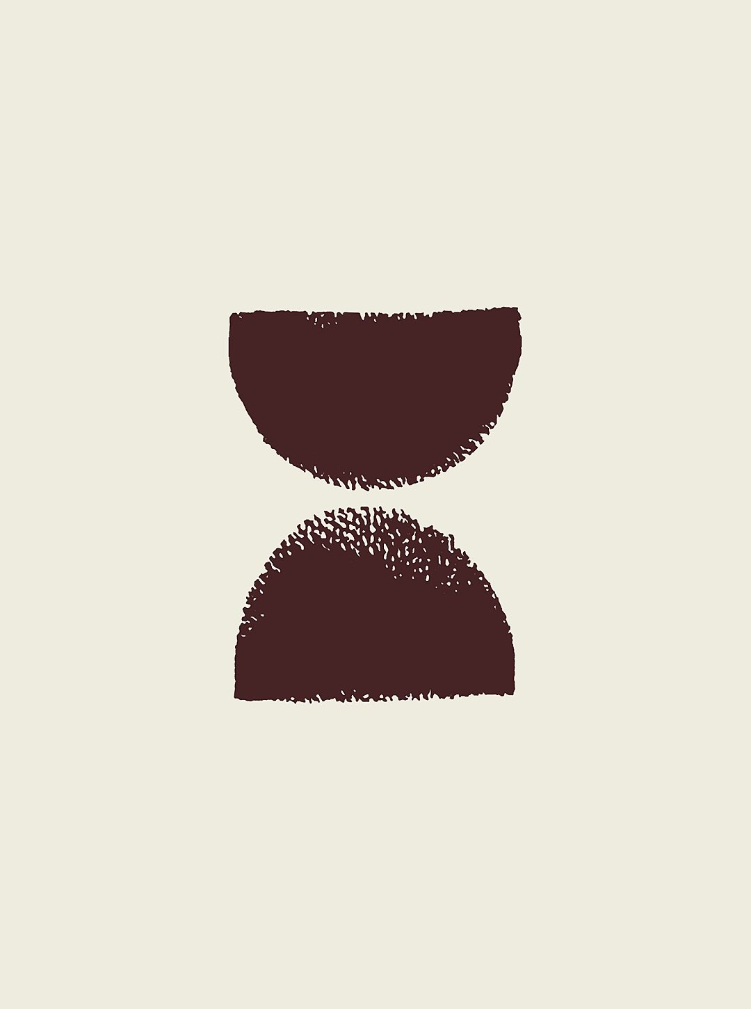
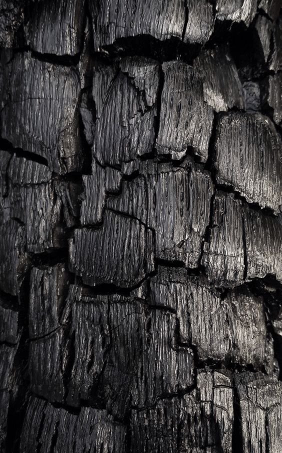
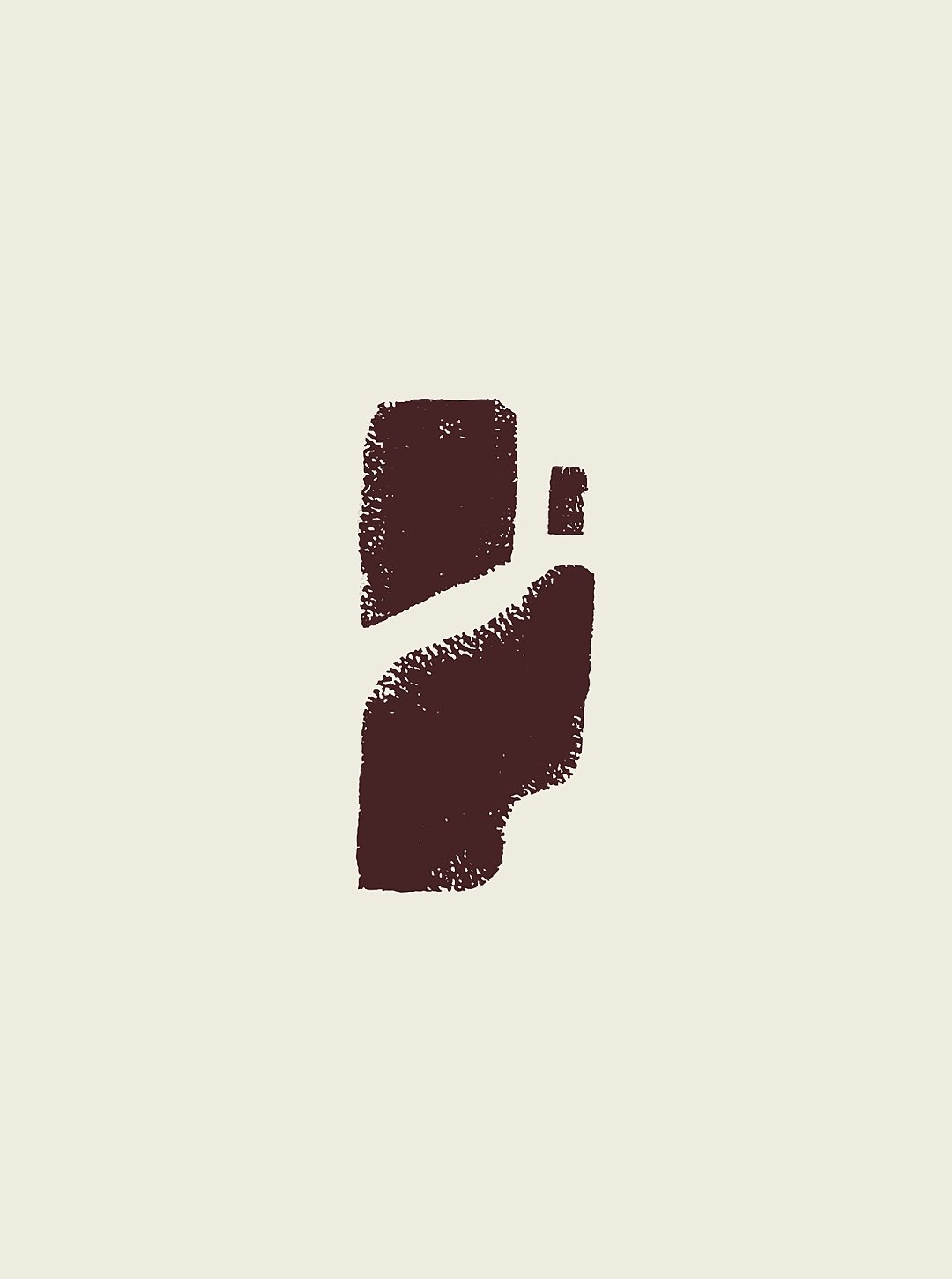
In the Hand Painted series, the artistry unfolds with pieces capturing the essence of warmth through the depiction of two cut firewood pieces embraced by a flame. The theme of Finding Patience takes shape through an hourglass, symbolizing patience and the inexhaustible nature of time. In another piece, the technique of Yakisugi is showcased with a zoomed-in section of charred wood, representing the traditional method of protecting timber siding.
The Halftones series, on the other hand, presents a collection of graphics featuring flames, thermal gradients, smoke, steam, and geothermal heat, creating a visual narrative of the bathing experience. Each piece is a testament to the artful fusion of craftsmanship and creativity in capturing the elements of the Slow Burn theme.
Every graphic found its place across the website, social platforms, and various other mediums, including theme-launching graphics, blog feature images, and more.

